Preface
Introduction
Thank you for purchasing Slick Menu WordPress plugin.
Slick Menu is an advanced plugin for creating unlimited off-canvas multi push vertical menus. It will let you customize and style your menus directly within WordPress customizer with live preview.
Each menu level can be customized independently. Many styling options are available. Level width, fonts, icons, colors, backgrounds, overlays, patterns, video backgrounds, lots of animation settings and much more.
Slick Menus are fully responsive and will work on every device.
Support and Resources
Release Notes
View the Change Log
Licensing
Regular License
Regular License is the most common type of licensing for Slick Menu. Regular license allows you to use item in one single end product which end user is not charged to access or use. You can acquire regular license for your own website, or if you are a developer – for one client by transferring the license to your client when the project is finished.
In order to read more about Regular license please visit CodeCanyon.
Extended License
Extended License allows use of the item in one single end product, which you or one client may sell to end users (charge end users to access or use the end product), but user do not have access to the source files in any case.
Extended license allows you to integrate Slick Menu into your WordPress theme to sell on ThemeForest.
In order to read more about Extended license please visit CodeCanyon.
Getting Started
Plugin Installation
Slick Menu installation doesn’t differ from any other plugin installation process, so you might be familiar with this process already. If not, please follow instructions below.
- Login to your website
- Go to Plugins -> Add New
- Click Upload Link
- Browse to the plugin’s zip file (it is located in the archive you’ve downloaded from CodeCanyon) and choose that file.
- Click “Install Now” button
- Wait while plugin is uploaded to your server
- Click “Activate Plugin” button
Congratulations, you are all set!
To start, visit the Slick Menu section within the dashboard menu.
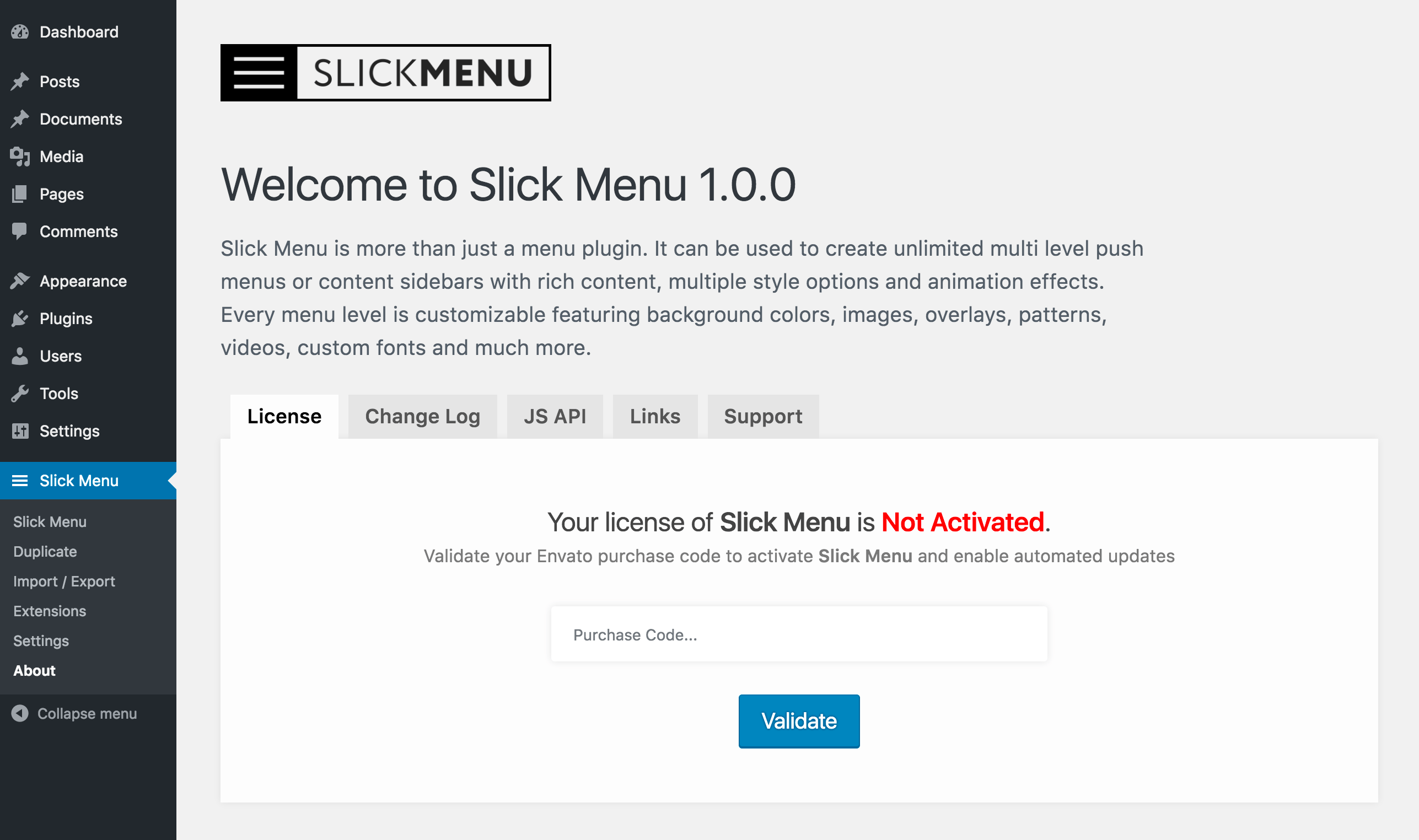
Plugin Activation
If you have bought Slick Menu directly from XplodedThemes it is necessary to activate your copy in order to have direct access to automated updates and official support page. In order to activate Slick Menu please follow these steps:
- Download your Purchase Code from Envato / Downloads Section
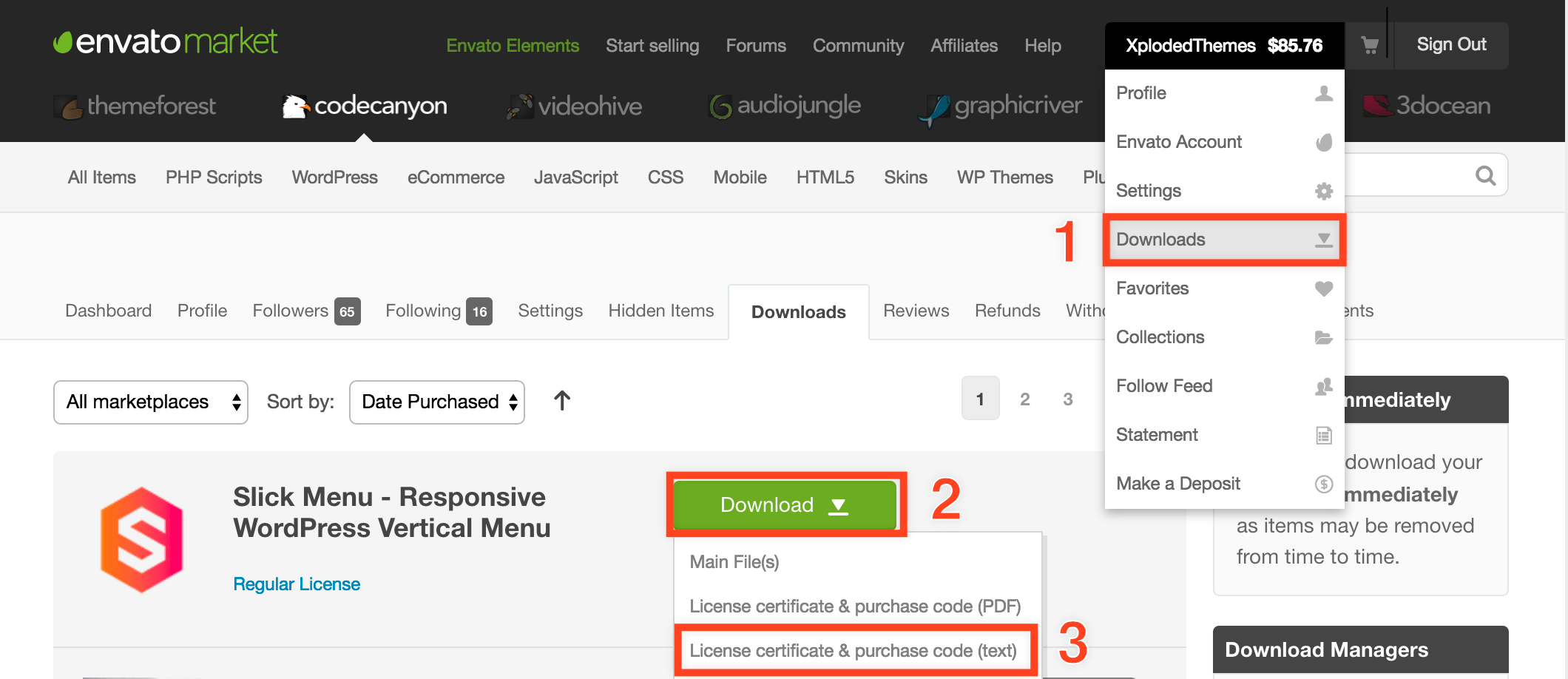
- Go to Slick Menu -> About -> License
- Enter and validate your purchase code
Plugin Update
- Automated updates.
Slick Menu supports automated updates. Simply validate your Purchase Code within the About section and automated updates will be enabled.
- Manual Update
You can also update Slick Menu manually, to perform it please follow these steps:- First, login to CodeCanyon and under your profile click Downloads link.
- Re-download Slick Menu and extract it.
- Now navigate to the Plugins menu in your WordPress admin area.
- Remove old copy of Slick Menu.
- Upload new version of Slick Menu.
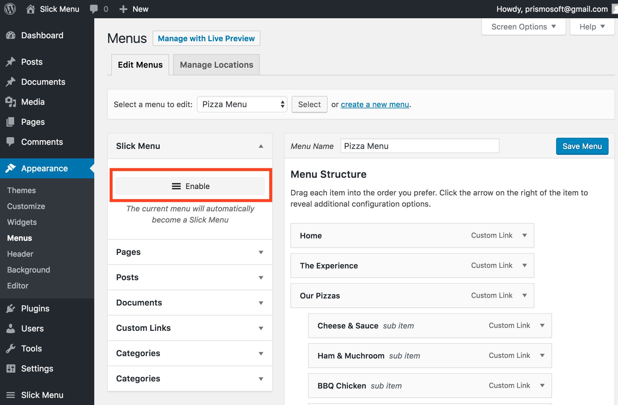
Enable Slick Menu
You can enable Slick Menus from 2 places.
- From the Appearance -> Menus section
- Go to Appearance -> Menus
- Create a new menu or select an existing one
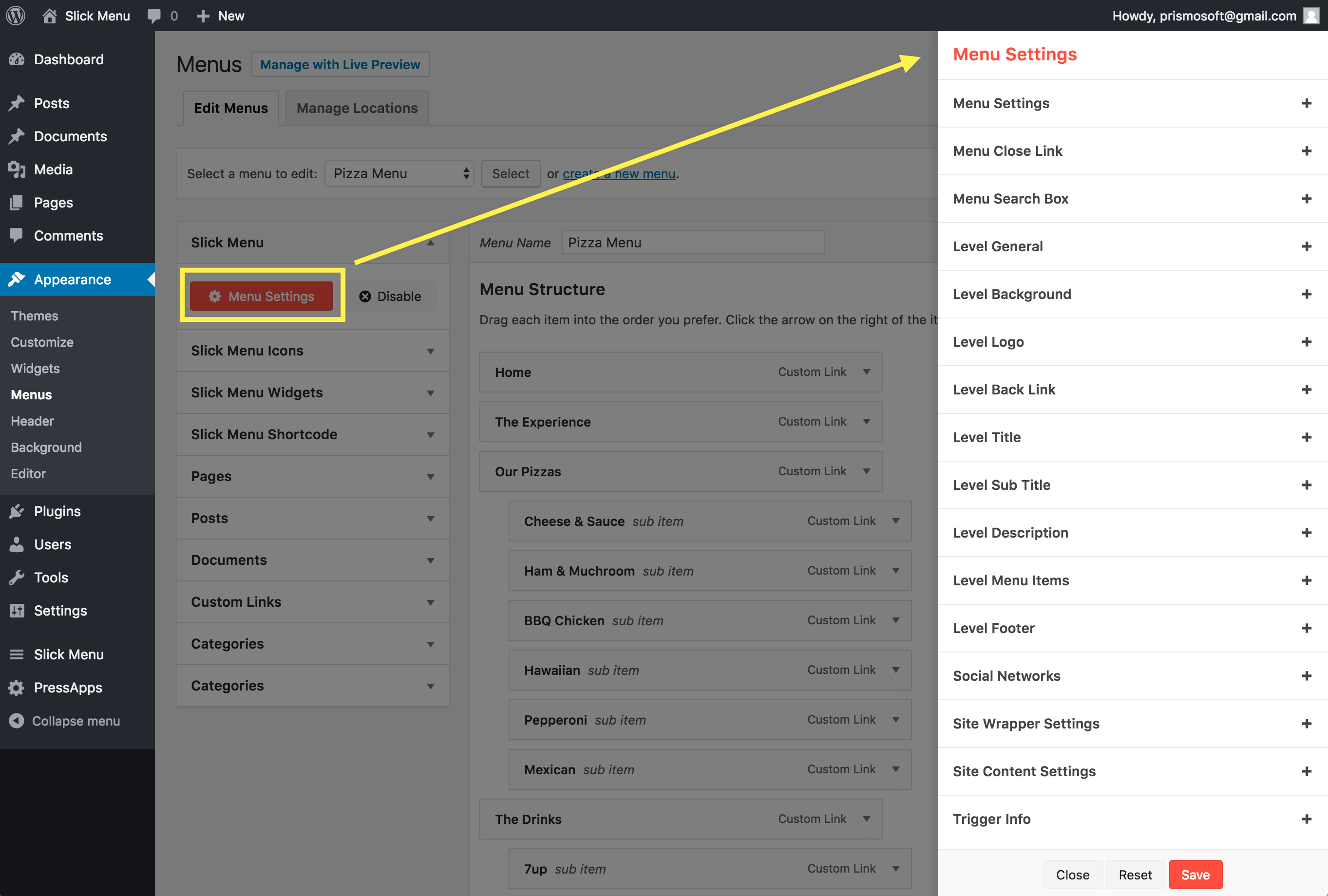
- Click the enable button within the Slick Menu left box
- Click the Menu Settings to start editing Global Menu settings. Global settings will affect the whole menu. Some options will only target the first menu level.
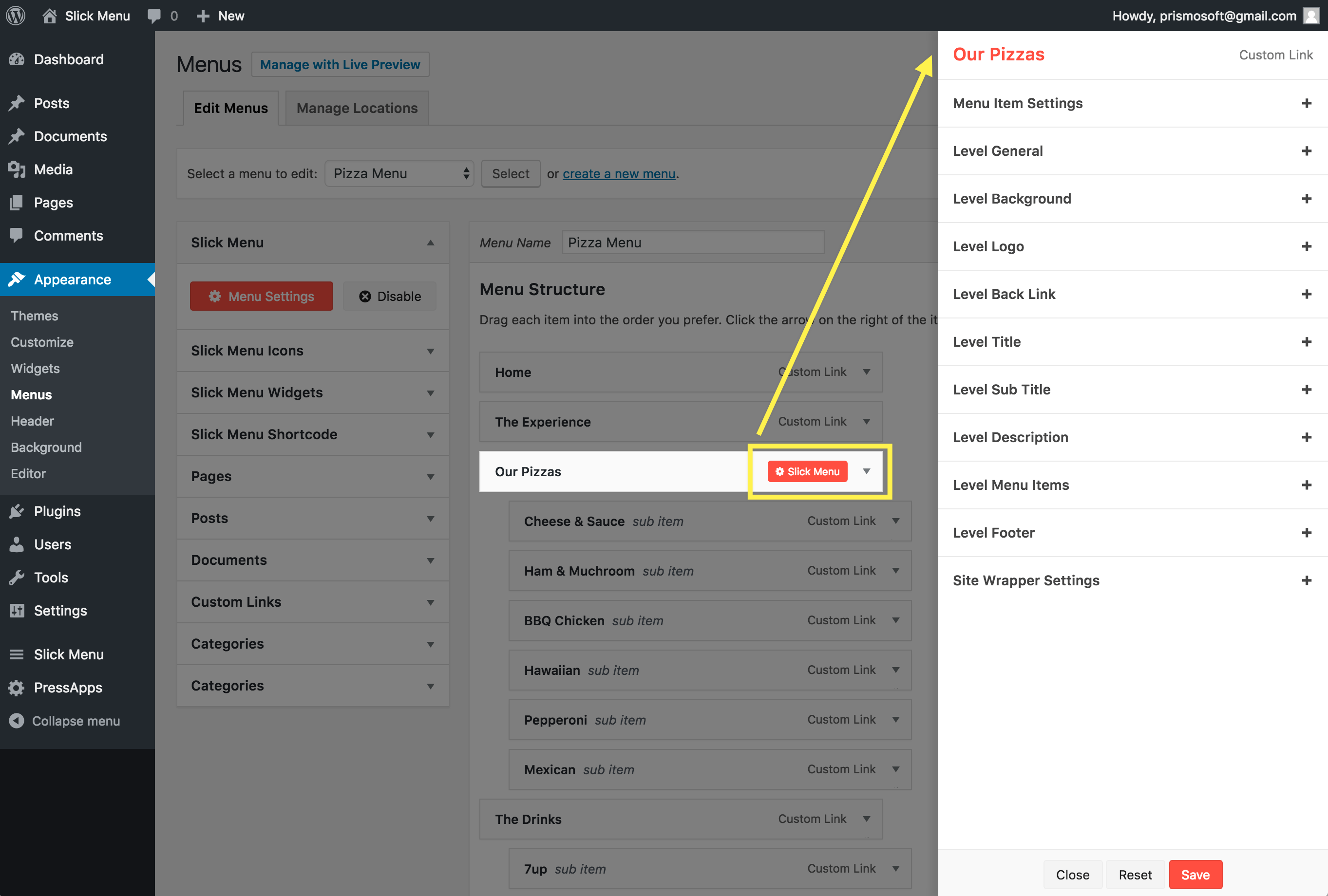
- You can edit individual levels by editing the menu item it self. By hovering over a menu item, a Slick Menu button will appear. Simply click the button and the menu item settings panel will open. These settings will only be applied to this menu item level and overrides the global settings
- From the Customizer
You can also do the same steps within WordPress Customizer which also lets you preview your changes while editing your menu.- Go to Appearance -> Customize -> Menus -> Select Menu
OR, if the menu is already enabled as Slick Menu
Go to Slick Menu -> Hover over the menu -> Click Edit In Customizer
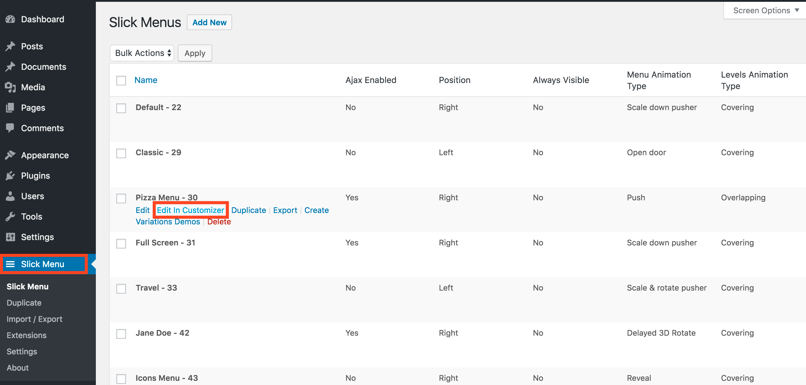
- If the menu is not yet enabled as Slick Menu, click the enable button to enable it.
- Click the Toggle Preview to view your menu within the Customizer Preview
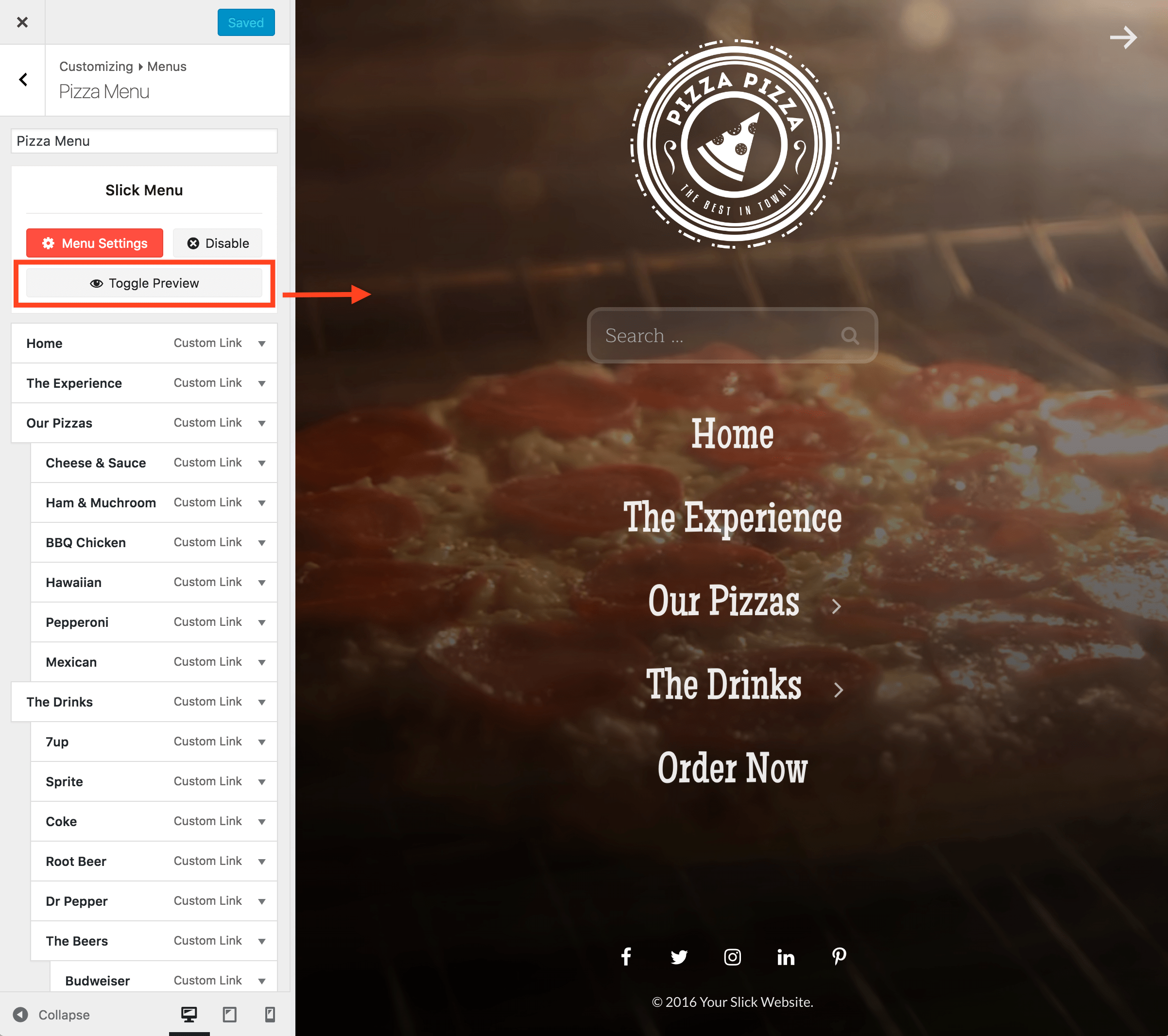
- Click the Menu Settings to edit the Global Settings or Hover over the menu items and click on the Slick Menu button to edit an individual menu item.
- Go to Appearance -> Customize -> Menus -> Select Menu
Learn More
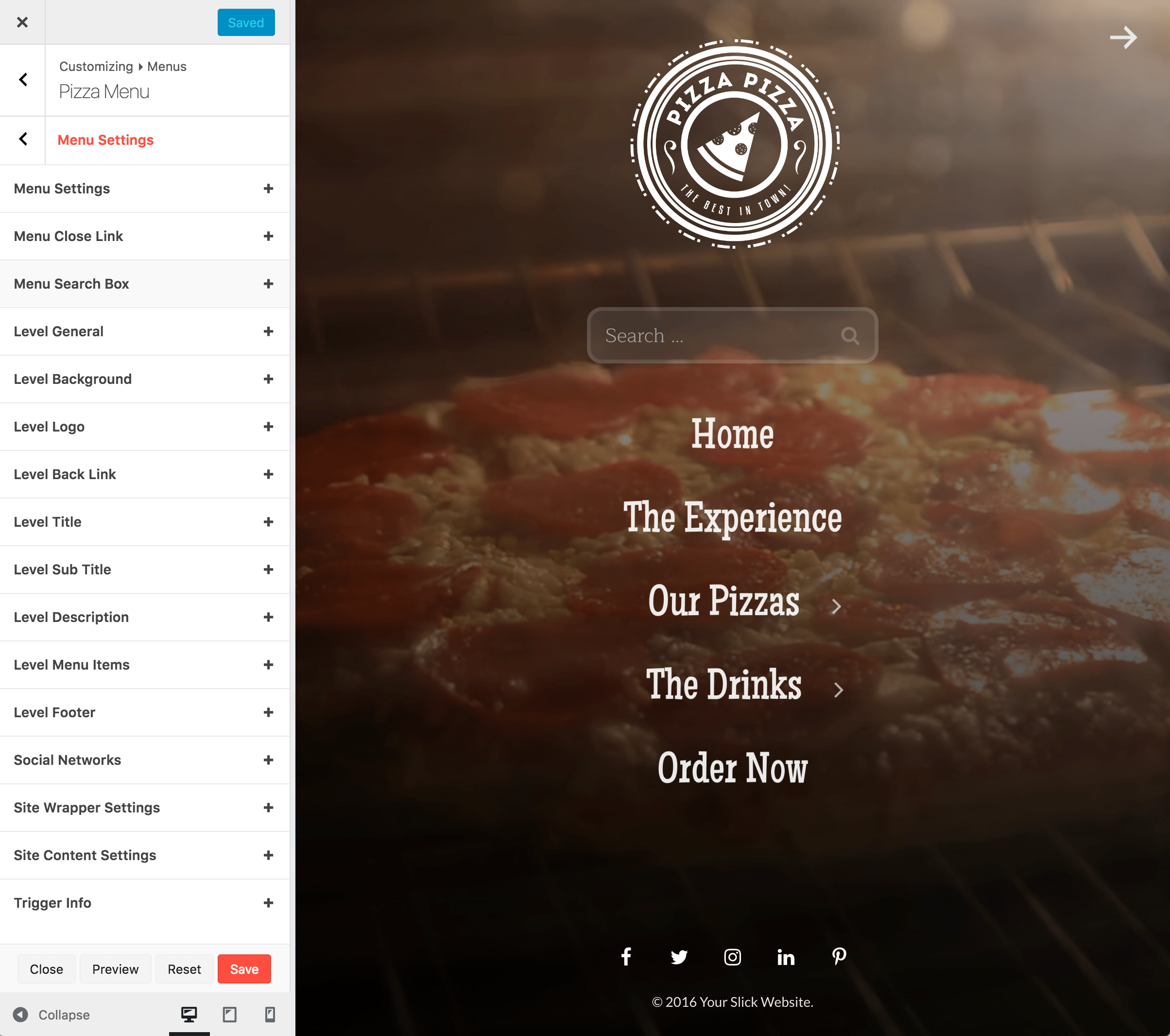
Global Settings
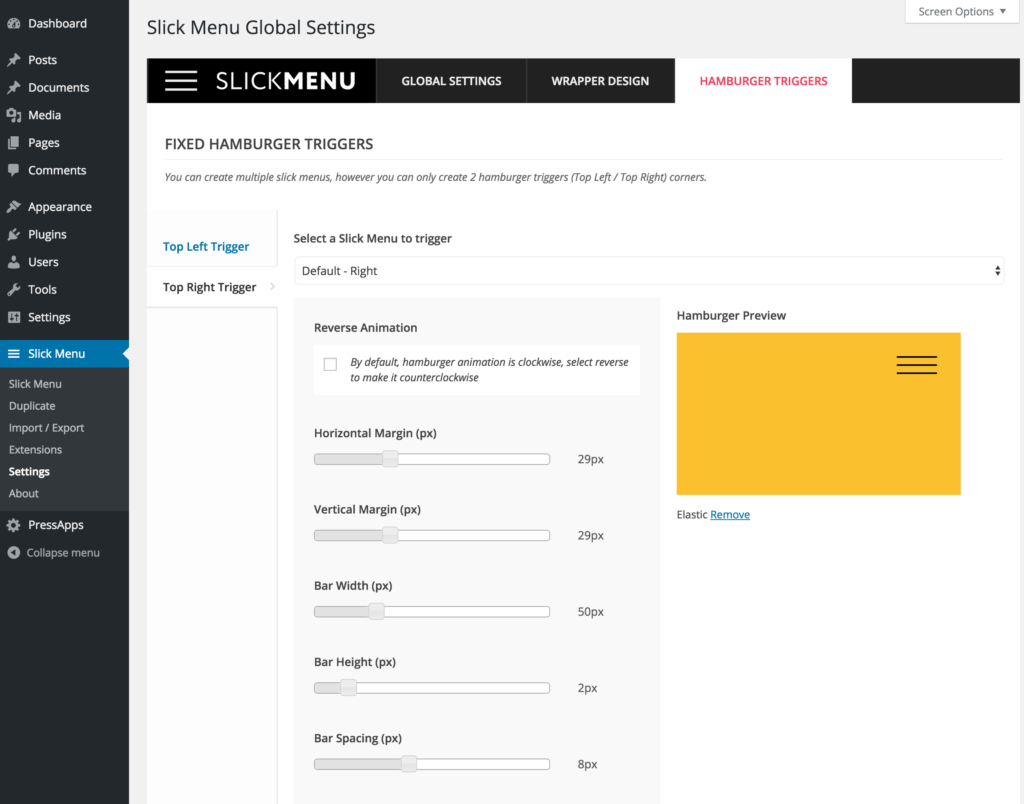
Within the settings menu, you can manage global settings such as Mobile Breakpoint, site wrapper backgrounds and the famous hamburger trigger.
Note: The wrapper background is actually the body background which is only visible if you have chosen a 3D menu animation that pushes the content in perspective view. Only in that case, you will be able to see the wrapper behind the site content. You can apply a background colors, images, patterns, overlays and videos.
Note: Default wrapper settings can be overridden within each menu and each menu item. Basically, you have the option to set a new wrapper background / video for each menu level. Whenever a new menu level is opened, the wrapper will transition to the new background / video.
Note: You can create multiple slick menus, however you can only create 2 hamburger triggers (Top Left / Top Right) corners. If you have more than 2 Slick Menus, you can still create custom triggers. More info on that here: Custom Triggers
Menu Settings
Menu settings are mostly global settings for the whole menu in general. Some options are only applied to the first menu level.
Note: Within an opened settings panel, you can switch from section to section without having to save every time. You can save once you finish with your customizations.
General Settings
- General
- Disable on selected pagesThis will completely remove the menu from the source code on selected pages. The menu will not be loaded even if set as "Always Visible". Note: within the customizer, this option requires a full page reload to take effect after saving.Possible Values:
- Menu Mobile BreakpointBreakpoint Width in px (Leave empty to inherit Global Settings)Default Value: --
- Load menu on demand using ajaxRecommended if you have created a lot of slick menus for a faster Page load. If disabled, the menu will be auto loaded on each pagePossible Values:
- No
- Yes
- Menu PositionSelect a menu positionPossible Values:
- Left
- Right
- Activate Current Menu Item on Menu OpenAutomatically open current menu item level once menu is openPossible Values:
- No
- Yes
- Always visibleYou can only have 1 menu set as "always visible", by enabling this option, any other visible menus will automatically be hidden.Possible Values:
- No
- Yes
- Horizontal ShadowDefault Value: 0
- Vertical ShadowDefault Value: 0
- Shadow DistanceDefault Value: 0
- Shadow Spread SizeDefault Value: 0
- Shadow ColorDefault Value: --
- Levels Animation TypeSelect a level animation typePossible Values:
- Covering
- Overlapping
- Menu Animation TypeSelect a menu animation typePossible Values:
- Fade in
- Slide in
- Reveal
- Push
- Slide along
- Reverse slide out
- Rotate pusher
- 3D rotate in
- 3D rotate out
- Scale down pusher
- Scale Up
- Scale & rotate pusher
- Open door
- Fall down
- Delayed 3D Rotate
- Scale in
- Scale out
- Menu Animation Type for Mobiles DevicesSelect a menu animation type that will be used for mobile devices.Possible Values:
- Fade in
- Slide in
- Reveal
- Slide along
- Scale in
- Scale out
- Menu Opening Animation DurationDefault Value: 500
- Menu Opening Animation EasingPossible Values:
- Linear
- Ease
- Ease-in
- Ease-out
- Ease-in-out
- EaseInQuad
- EaseInCubic
- EaseInQuart
- EaseInQuint
- EaseInSine
- EaseInExpo
- EaseInCirc
- EaseInBack
- EaseOutQuad
- EaseOutCubic
- EaseOutQuart
- EaseOutQuint
- EaseOutSine
- EaseOutExpo
- EaseOutCirc
- EaseOutBack
- EaseInOutQuad
- EaseInOutCubic
- EaseInOutQuart
- EaseInOutQuint
- EaseInOutSine
- EaseInOutExpo
- EaseInOutCirc
- EaseInOutBack
- Menu Closing Animation DurationDefault Value: 500
- Menu Closing Animation EasingPossible Values:
- Linear
- Ease
- Ease-in
- Ease-out
- Ease-in-out
- EaseInQuad
- EaseInCubic
- EaseInQuart
- EaseInQuint
- EaseInSine
- EaseInExpo
- EaseInCirc
- EaseInBack
- EaseOutQuad
- EaseOutCubic
- EaseOutQuart
- EaseOutQuint
- EaseOutSine
- EaseOutExpo
- EaseOutCirc
- EaseOutBack
- EaseInOutQuad
- EaseInOutCubic
- EaseInOutQuart
- EaseInOutQuint
- EaseInOutSine
- EaseInOutExpo
- EaseInOutCirc
- EaseInOutBack
- Menu Overlap Title Font FamilyDefault Value: Lato:400
- Menu Overlap Title ColorApplicable for overlapping LevelsDefault Value: #ffffff
- Menu Overlap Icon ColorApplicable for overlapping LevelsDefault Value: #ffffff
- Menu Overlap Background ColorApplicable for overlapping LevelsDefault Value: Rgba(0, 0, 0, 0.3)
Close Link
- General
- Close Link HiddenPossible Values:
- No
- Yes
- Close Link PositionPossible Values:
- Left
- Center
- Right
- Colors
- Close Link ColorDefault Value: Rgba(255,255,255,0.8)
- Close Link Hover ColorDefault Value: Rgba(255,255,255,1)
- Close Link Background ColorDefault Value: --
- Close Link Hover Background ColorDefault Value: --
- Icon
- Close Link IconSet an arrow iconDefault ValuesType: Genericon
Icon: Genericon-close-alt - Close Link Icon SizeEnter size in (%, px)Default Value: 25px
- Spacing
- Close Link PaddingPadding in (%, px). [top right bottom left] Ex: 20px or 20px 10pxDefault Value: --
- Close Link MarginMargin in (%, px). [top right bottom left] Ex: 20px or 20px 10pxDefault Value: 10px 20px
- Border
- Border Top WidthDefault Value: 0
- Border Right WidthDefault Value: 0
- Border Bottom WidthDefault Value: 0
- Border Left WidthDefault Value: 0
- Border RadiusDefault Value: 0
- Border StylePossible Values:
- None
- Solid
- Dotted
- Dashed
- Double
- Border ColorDefault Value: --
- Animations
- Close Link AnimationPossible Values:
- Bounce
- Flash
- Pulse
- RubberBand
- Shake
- Swing
- Tada
- Wobble
- Jello
- BounceIn
- BounceInDown
- BounceInLeft
- BounceInRight
- BounceInUp
- FadeIn
- FadeInDown
- FadeInDownBig
- FadeInLeft
- FadeInLeftBig
- FadeInRight
- FadeInRightBig
- FadeInUp
- FadeInUpBig
- Flip
- FlipInX
- FlipInY
- LightSpeedIn
- RotateIn
- RotateInDownLeft
- RotateInDownRight
- RotateInUpLeft
- RotateInUpRight
- SlideInUp
- SlideInDown
- SlideInLeft
- SlideInRight
- ZoomIn
- ZoomInDown
- ZoomInLeft
- ZoomInRight
- ZoomInUp
- Hinge
- RollIn
- RollOut
Level Search Box
- General
- Search EnabledPossible Values:
- No
- Yes
- Search Text AlignPossible Values:
- Left
- Center
- Right
- Show Search Placeholder TextPossible Values:
- No
- Yes
- Font & Style
- Search Font FamilyDefault Value: Lato:300
- Search Font SizeEnter size in (%, px)Default Value: 20px
- Colors
- Search Background ColorDefault Value: Rgba(255, 255, 255, 0.1)
- Search Font ColorDefault Value: Rgba(255, 255, 255, 0.7)
- Icon
- Search Icon PositionPossible Values:
- Left
- Right
- Search Icon SizeDefault Value: 20px
- Search Icon ColorDefault Value: Rgba(255, 255, 255, 0.7)
- Spacing
- Search Box WidthWidth is 100% by defaultDefault Value: --
- Search Box MarginMargin in (%, px). [top right bottom left] Ex: 20px or 20px 10pxDefault Value: 15px
- Search Box Horizontal PaddingHorizontal Padding in (%, px). Ex: 15pxDefault Value: 15px
- Border
- Border Top WidthDefault Value: 0
- Border Right WidthDefault Value: 0
- Border Bottom WidthDefault Value: 0
- Border Left WidthDefault Value: 0
- Border RadiusDefault Value: 0
- Border StylePossible Values:
- None
- Solid
- Dotted
- Dashed
- Double
- Border ColorDefault Value: --
- Animations
- Search AnimationPossible Values:
- Bounce
- Flash
- Pulse
- RubberBand
- Shake
- Swing
- Tada
- Wobble
- Jello
- BounceIn
- BounceInDown
- BounceInLeft
- BounceInRight
- BounceInUp
- FadeIn
- FadeInDown
- FadeInDownBig
- FadeInLeft
- FadeInLeftBig
- FadeInRight
- FadeInRightBig
- FadeInUp
- FadeInUpBig
- Flip
- FlipInX
- FlipInY
- LightSpeedIn
- RotateIn
- RotateInDownLeft
- RotateInDownRight
- RotateInUpLeft
- RotateInUpRight
- SlideInUp
- SlideInDown
- SlideInLeft
- SlideInRight
- ZoomIn
- ZoomInDown
- ZoomInLeft
- ZoomInRight
- ZoomInUp
- Hinge
- RollIn
- RollOut
Level General Settings
- General
- Level WidthSet a width in (%, px, vw). Use the vw unit to enter a percentage related to the viewport width. Ex 50vw would make the width equal to half the window width.Default Value: 350px
- Level Mobile CenteredForce level content to be centered on mobile breakpointPossible Values:
- No
- Yes
- Inner Level Vertical AlignPossible Values:
- Top
- Middle
- Bottom
- Level Disable ScrollPossible Values:
- No
- Yes
- Level Show Scroll BarPossible Values:
- No
- Yes
- Level Auto Scroll To Current ItemPossible Values:
- No
- Yes
- Spacing
- Level PaddingPadding in (%, px). [top right bottom left] Ex: 20px or 20px 10pxDefault Value: 40px 0
Level Header
- General
- Level Header Stick To TopThe level header that includes the Logo and the search box, will be sticked to the topPossible Values:
- No
- Yes
- Level Header Over ContentPossible Values:
- No
- Yes
- Background Color / Image
- Background ImageDefault Value: --
- Background ColorDefault Value: --
- Background RepeatPossible Values:
- No Repeat
- Repeat All
- Repeat Horizontally
- Repeat Vertically
- Background SizePossible Values:
- Cover
- Contain
- Background PositionPossible Values:
- Left Top
- Left Center
- Left Bottom
- Center Top
- Center Center
- Center Bottom
- Right Top
- Right Center
- Right Bottom
- Background Pattern
- PatternPossible Values:
- OpacitySet pattern opacity, a lower value makes the pattern more transparentDefault Value: 0.5
- Background Overlay
- TypePossible Values:
- Solid Color
- Gradient
- ColorDefault Value: --
- DirectionPossible Values:
- To Right
- To Left
- To Top
- To Bottom
- Color StartDefault Value: --
- Color EndDefault Value: --
- Spacing
- Header Wrapper PaddingPadding in (%, px). [top right bottom left] Ex: 20px or 20px 10pxDefault Value: 0 25px 25px
- Header Wrapper MarginMargin in (%, px). [top right bottom left] Ex: 20px or 20px 0Default Value: --
Level Background
- Background Color / Image
- Background ImageDefault Value: --
- Background ColorDefault Value: #244c75
- Background RepeatPossible Values:
- No Repeat
- Repeat All
- Repeat Horizontally
- Repeat Vertically
- Background SizePossible Values:
- Cover
- Contain
- Background PositionPossible Values:
- Left Top
- Left Center
- Left Bottom
- Center Top
- Center Center
- Center Bottom
- Right Top
- Right Center
- Right Bottom
- Apply background to sub levelsDefault Value: 0
- Background Pattern
- PatternPossible Values:
- OpacitySet pattern opacity, a lower value makes the pattern more transparentDefault Value: 0.5
- Apply pattern to sub levelsDefault Value: 0
- Background Overlay
- TypePossible Values:
- Solid Color
- Gradient
- ColorDefault Value: --
- DirectionPossible Values:
- To Right
- To Left
- To Top
- To Bottom
- Color StartDefault Value: --
- Color EndDefault Value: --
- Apply overlay to sub levelsDefault Value: 0
- Background Video
- Youtube Video IDEx: LSmgKRx5pBoDefault Value: --
- QualityWe recommend that you set the parameter value to default, which instructs YouTube to select the most appropriate playback quality, which will vary for different users, videos, systems and other playback conditions.Possible Values:
- Default
- Small
- Medium
- Large
- HD 720
- HD 1080
- High Resolution
- OpacitySet video opacity, a lower value makes the video more transparentDefault Value: 1
- Scale VideoScaling the video is useful to hide top and bottom black borders in some videosDefault Value: 1
- Start Video AtSecond in which video should begin playing atDefault Value: --
- End Video AtSecond in which video should end playing atDefault Value: --
- Never PauseBy default, the video will be paused and hidden on inactive menu levels and will be un-paused once the level is active againDefault Value: 0
- RepeatLoop video indefinitelyDefault Value: 1
- Play AudioDefault Value: 0
- Show Loading AnimationDefault Value: 0
- Place behind background overlayDefault Value: 0
- Mobile Video Embed FallbackVideo backgrounds are not supported on mobile. Enable this fallback option to make the video available on mobile as a regular embed video player.Default Value: 0
Level Logo
- General
- Show logo on main level onlyPossible Values:
- No
- Yes
- Use logged in user Avatar as a logoPossible Values:
- No
- Yes
- Logo ImageDefault Value: --
- Logo UrlDefault Value: --
- Logo WidthEnter Width in (%, px)Default Value: 100px
- Logo HeightEnter Height in (%, px)Default Value: --
- Logo AlignPossible Values:
- Left
- Center
- Right
- Spacing
- Logo PaddingPadding in (%, px). [top right bottom left] Ex: 20px or 20px 10pxDefault Value: 40px 25px
- Border
- Border Top WidthDefault Value: 0
- Border Right WidthDefault Value: 0
- Border Bottom WidthDefault Value: 0
- Border Left WidthDefault Value: 0
- Border RadiusDefault Value: 0
- Border StylePossible Values:
- None
- Solid
- Dotted
- Dashed
- Double
- Border ColorDefault Value: --
- Animations
- Logo AnimationPossible Values:
- Bounce
- Flash
- Pulse
- RubberBand
- Shake
- Swing
- Tada
- Wobble
- Jello
- BounceIn
- BounceInDown
- BounceInLeft
- BounceInRight
- BounceInUp
- FadeIn
- FadeInDown
- FadeInDownBig
- FadeInLeft
- FadeInLeftBig
- FadeInRight
- FadeInRightBig
- FadeInUp
- FadeInUpBig
- Flip
- FlipInX
- FlipInY
- LightSpeedIn
- RotateIn
- RotateInDownLeft
- RotateInDownRight
- RotateInUpLeft
- RotateInUpRight
- SlideInUp
- SlideInDown
- SlideInLeft
- SlideInRight
- ZoomIn
- ZoomInDown
- ZoomInLeft
- ZoomInRight
- ZoomInUp
- Hinge
- RollIn
- RollOut
Level Back Link
- General
- Back Link HiddenPossible Values:
- No
- Yes
- Back Link PositionPossible Values:
- Stick to top
- Above
- Below
- Stick to bottom
- Back Link AlignPossible Values:
- Left
- Center
- Right
- Font & Style
- Back Link Font FamilyDefault Value: Lato:400
- Back Link Font SizeEnter size in (%, px)Default Value: 16px
- Colors
- Back Link ColorDefault Value: Rgba(255,255,255,0.8)
- Back Link Hover ColorDefault Value: Rgba(255,255,255,1)
- Icon
- Back Link IconSet an arrow iconDefault ValuesType: Fa
Icon: Fa-long-arrow-right - Back Link Show Icon Without TextPossible Values:
- No
- Yes
- Back Link Icon PositionPossible Values:
- Before
- After
- Above
- Below
- Back Link Icon SizeEnter size in (%, px)Default Value: 22px
- Spacing
- Back Link PaddingPadding in (%, px). [top right bottom left] Ex: 20px or 20px 10pxDefault Value: --
- Back Link MarginMargin in (%, px). [top right bottom left] Ex: 20px or 20px 10pxDefault Value: 20px
Level Title
- General
- Title HiddenPossible Values:
- No
- Yes
- Title OverrideDefault Value: --
- Title FullwidthPossible Values:
- No
- Yes
- Title Stick To TopPossible Values:
- No
- Yes
- Title PositionPossible Values:
- Left
- Center
- Right
- Font & Style
- Title Font FamilyDefault Value: Lato:400
- Title Font SizeEnter size in (%, px)Default Value: 24px
- Title Text TransformPossible Values:
- None
- Capitalize
- Uppercase
- Lowercase
- Initial
- Inherit
- Title Text AlignPossible Values:
- Left
- Center
- Right
- Justify
- Colors
- Title Font ColorDefault Value: #ffffff
- Title Background ColorDefault Value: Rgba(0,0,0,0.1)
- Icon
- Title IconThe title will inherit the item iconPossible Values:
- No
- Yes
- Title IconApplies to main level only.Default Value: --
- Title Icon SizeEnter size in (%, px)Default Value: 24px
- Title Icon ColorDefault Value: #ffffff
- Spacing
- Title PaddingPadding in (%, px). [top right bottom left] Ex: 20px or 20px 10pxDefault Value: 20px
- Title MarginMargin in (%, px). [top right bottom left] Ex: 20px or 20px 10pxDefault Value: 0 0 15px 0
- Border
- Border Top WidthDefault Value: 0
- Border Right WidthDefault Value: 0
- Border Bottom WidthDefault Value: 0
- Border Left WidthDefault Value: 0
- Border RadiusDefault Value: 0
- Border StylePossible Values:
- None
- Solid
- Dotted
- Dashed
- Double
- Border ColorDefault Value: --
- Animations
- Title AnimationPossible Values:
- Bounce
- Flash
- Pulse
- RubberBand
- Shake
- Swing
- Tada
- Wobble
- Jello
- BounceIn
- BounceInDown
- BounceInLeft
- BounceInRight
- BounceInUp
- FadeIn
- FadeInDown
- FadeInDownBig
- FadeInLeft
- FadeInLeftBig
- FadeInRight
- FadeInRightBig
- FadeInUp
- FadeInUpBig
- Flip
- FlipInX
- FlipInY
- LightSpeedIn
- RotateIn
- RotateInDownLeft
- RotateInDownRight
- RotateInUpLeft
- RotateInUpRight
- SlideInUp
- SlideInDown
- SlideInLeft
- SlideInRight
- ZoomIn
- ZoomInDown
- ZoomInLeft
- ZoomInRight
- ZoomInUp
- Hinge
- RollIn
- RollOut
Level Sub Title
- General
- Sub Title EnabledPossible Values:
- No
- Yes
- Sub TitleDefault Value: --
- Font & Style
- Sub Title Font FamilyDefault Value: Lato:400
- Sub Title Font SizeEnter size in (%, px)Default Value: 24px
- Sub Title Text TransformPossible Values:
- None
- Capitalize
- Uppercase
- Lowercase
- Initial
- Inherit
- Sub Title Text AlignPossible Values:
- Left
- Center
- Right
- Justify
- Colors
- Sub Title Font ColorDefault Value: #ffffff
- Sub Title Background ColorDefault Value: --
- Spacing
- Sub Title PaddingPadding in (%, px). [top right bottom left] Ex: 20px or 20px 10pxDefault Value: 20px
- Sub Title MarginMargin in (%, px). [top right bottom left] Ex: 20px or 20px 10pxDefault Value: 0 0 15px 0
- Border
- Border Top WidthDefault Value: 0
- Border Right WidthDefault Value: 0
- Border Bottom WidthDefault Value: 0
- Border Left WidthDefault Value: 0
- Border RadiusDefault Value: 0
- Border StylePossible Values:
- None
- Solid
- Dotted
- Dashed
- Double
- Border ColorDefault Value: --
- Animations
- Sub Title AnimationPossible Values:
- Bounce
- Flash
- Pulse
- RubberBand
- Shake
- Swing
- Tada
- Wobble
- Jello
- BounceIn
- BounceInDown
- BounceInLeft
- BounceInRight
- BounceInUp
- FadeIn
- FadeInDown
- FadeInDownBig
- FadeInLeft
- FadeInLeftBig
- FadeInRight
- FadeInRightBig
- FadeInUp
- FadeInUpBig
- Flip
- FlipInX
- FlipInY
- LightSpeedIn
- RotateIn
- RotateInDownLeft
- RotateInDownRight
- RotateInUpLeft
- RotateInUpRight
- SlideInUp
- SlideInDown
- SlideInLeft
- SlideInRight
- ZoomIn
- ZoomInDown
- ZoomInLeft
- ZoomInRight
- ZoomInUp
- Hinge
- RollIn
- RollOut
Level Description
- General
- Description EnabledPossible Values:
- No
- Yes
- Use WordPress page as content?Possible Values:
- No
- Yes
- DescriptionShortcodes are supported however styling shortcode output is up to the user and might require some CSS knowledge. Also note that some shortcodes might not work properly if Slick Menu is set to load via Ajax.Default Value: --
- Select Description PageShortcodes are supported however styling shortcode output is up to the user and might require some CSS knowledge. Also note that some shortcodes might not work properly if Slick Menu is set to load via Ajax.Default Value: --
- Font & Style
- Description Font FamilyDefault Value: Lato:400
- Description Font SizeEnter size in (%, px)Default Value: 18px
- Description Line HeightEnter line height in (px)Default Value: 24px
- Description Text TransformPossible Values:
- None
- Capitalize
- Uppercase
- Lowercase
- Initial
- Inherit
- Description Text AlignPossible Values:
- Left
- Center
- Right
- Justify
- Colors
- Description Font ColorDefault Value: #ffffff
- Description Background ColorDefault Value: --
- Spacing
- Description Max WidthSet a max width in (%, px, vw). Use the vw unit to enter a percentage related to the viewport width. Ex 50vw would make the width equal to half the window width.Default Value: --
- Description PaddingPadding in (%, px). [top right bottom left] Ex: 20px or 20px 10pxDefault Value: 20px
- Description MarginMargin in (%, px). [top right bottom left] Ex: 20px or 20px 10pxDefault Value: 0 0 15px 0
- Border
- Border Top WidthDefault Value: 0
- Border Right WidthDefault Value: 0
- Border Bottom WidthDefault Value: 0
- Border Left WidthDefault Value: 0
- Border RadiusDefault Value: 0
- Border StylePossible Values:
- None
- Solid
- Dotted
- Dashed
- Double
- Border ColorDefault Value: --
- Animations
- Description AnimationPossible Values:
- Bounce
- Flash
- Pulse
- RubberBand
- Shake
- Swing
- Tada
- Wobble
- Jello
- BounceIn
- BounceInDown
- BounceInLeft
- BounceInRight
- BounceInUp
- FadeIn
- FadeInDown
- FadeInDownBig
- FadeInLeft
- FadeInLeftBig
- FadeInRight
- FadeInRightBig
- FadeInUp
- FadeInUpBig
- Flip
- FlipInX
- FlipInY
- LightSpeedIn
- RotateIn
- RotateInDownLeft
- RotateInDownRight
- RotateInUpLeft
- RotateInUpRight
- SlideInUp
- SlideInDown
- SlideInLeft
- SlideInRight
- ZoomIn
- ZoomInDown
- ZoomInLeft
- ZoomInRight
- ZoomInUp
- Hinge
- RollIn
- RollOut
Level Nav Menu
- General
- Nav Menu Max WidthWidth in (%, px). Ex: 50% or 200pxDefault Value: --
- Nav Menu AlignPossible Values:
- Left
- Center
- Right
- Nav Menu Items ColumnsSelect a default column layout used to display the items. This can be overridden within individual items.Possible Values:
- Display items in 1 columns
- Display items in 2 columns
- Display items in 3 columns
- Display items in 4 columns
- Display items in 5 columns
- Display items in 6 columns
- Display items in 7 columns
- Display items in 8 columns
- Display items in 9 columns
- Display items in 10 columns
- Display items in 11 columns
- Display items in 12 columns
- Nav Menu Items Column AlignPossible Values:
- Left
- Center
- Right
- Spacing
- Nav Menu PaddingPadding in (%, px). [top right bottom left] Ex: 20px or 20px 10pxDefault Value: --
Level Nav Menu Items
- General
- HiddenPossible Values:
- No
- Yes
- Hide LabelApplicable only if a menu item icon is setPossible Values:
- No
- Yes
- Hide Label VisibilityPossible Values:
- Always Visible
- Visible On Hover
- Hidden On Hover
- FullwidthPossible Values:
- No
- Yes
- Height (optional)Set a height in (%, px, vh). Useful to build grids. Use the vh unit to enter a percentage related to the viewport height. Ex 50vh would make the height equal to half the window height.Default Value: --
- Font & Style
- Font FamilyDefault Value: Lato:400
- Font SizeEnter size in (%, px)Default Value: 20px
- Line HeightEnter line height in (px)Default Value: 25px
- Text TransformPossible Values:
- None
- Capitalize
- Uppercase
- Lowercase
- Initial
- Inherit
- Text AlignPossible Values:
- Left
- Center
- Right
- Justify
- Vertical AlignPossible Values:
- Top
- Middle
- Bottom
- Colors
- Font ColorDefault Value: Rgba(255, 255, 255, 0.9)
- Background ColorDefault Value: --
- Active Text ColorDefault Value: #ffffff
- Active Background ColorDefault Value: Rgba(0,0,0,0.1)
- Hover Text ColorDefault Value: #ffffff
- Hover Background ColorDefault Value: Rgba(0,0,0,0.1)
- Spacing
- PaddingPadding in (%, px). [top right bottom left] Ex: 20px or 20px 10pxDefault Value: 15px 50px
- MarginMargin in (%, px). [top right bottom left] Ex: 20px or 20px 10pxDefault Value: --
- Border
- Border Top WidthDefault Value: 0
- Border Right WidthDefault Value: 0
- Border Bottom WidthDefault Value: 0
- Border Left WidthDefault Value: 0
- Border RadiusDefault Value: 0
- Border StylePossible Values:
- None
- Solid
- Dotted
- Dashed
- Double
- Border ColorDefault Value: --
- Icon
- Icon SizeEnter size in (%, px)Default Value: 25px
- Icon Line HeightEnter size in (px)Default Value: --
- Icon WidthEnter width in (px). Sometimes icons have irregular sizes, you might need to adjust the icon width to make sure that menu item titles are aligned properlyDefault Value: --
- Icon Honrizontal AlignOnly useful if you have set an icon widthPossible Values:
- Left
- Center
- Right
- Icon Vertical AlignPossible Values:
- Top
- Middle
- Bottom
- Icon ColorDefault Value: Rgba(255, 255, 255, 0.9)
- Icon Hover ColorDefault Value: #ffffff
- Arrow
- Arrow IconSet an arrow iconDefault ValuesType: Fa
Icon: Fa-angle-right - Arrow HidePossible Values:
- No
- Yes
- Arrow PositionPossible Values:
- Left
- Right
- Arrow SizeEnter size in (%, px)Default Value: 22px
- Arrow Horizontal OffsetDefault Value: 0
- Arrow Vertical OffsetDefault Value: 0
- Arrow ColorDefault Value: Rgba(255,255,255,0.6)
- Hover Arrow ColorDefault Value: Rgba(255,255,255,0.6)
- Image
- Thumbnail PositionPossible Values:
- Above Title
- Below Title
- Behind Title
- Replace Title
- Thumbnail Background RepeatPossible Values:
- No Repeat
- Repeat All
- Repeat Horizontally
- Repeat Vertically
- Thumbnail Background SizePossible Values:
- Cover
- Contain
- Thumbnail Background PositionPossible Values:
- Left Top
- Left Center
- Left Bottom
- Center Top
- Center Center
- Center Bottom
- Right Top
- Right Center
- Right Bottom
- Thumbnail SizePossible Values:
- Thumbnail x 150 Cropped
- Medium x 300
- Medium_large
- Large x 1024
- 1536x1536 x 1536
- 2048x2048 x 2048
- Custom Size
- Thumbnail WidthDefault Value: --
- Thumbnail HeightDefault Value: --
- Thumbnail CropPossible Values:
- No
- Yes
- Thumbnail StretchThis will stretch the image to fit it's containerPossible Values:
- No
- Yes
- Thumbnail MarginMargin in (%, px). [top right bottom left] Ex: 20px or 20px autoDefault Value: 10px auto
- TypePossible Values:
- Solid Color
- Gradient
- ColorDefault Value: --
- DirectionPossible Values:
- To Right
- To Left
- To Top
- To Bottom
- Color StartDefault Value: --
- Color EndDefault Value: --
- TypePossible Values:
- Solid Color
- Gradient
- ColorDefault Value: --
- DirectionPossible Values:
- To Right
- To Left
- To Top
- To Bottom
- Color StartDefault Value: --
- Color EndDefault Value: --
- Thumbnail FilterApply a filter to the thumbnailPossible Values:
- Brightness
- Grayscale
- Sepia
- Saturate
- Invert
- Opacity
- Contrast
- Blur
- Tint
- Inkwell
- Hue Rotate 90deg
- Hue Rotate 180deg
- Hue Rotate 270deg
- Hue Rotate 360deg
- Half Transparent
- Fully Transparent
- Thumbnail Hover FilterApply a filter to the thumbnail on hoverPossible Values:
- None
- Brightness
- Grayscale
- Sepia
- Saturate
- Invert
- Opacity
- Contrast
- Blur
- Tint
- Inkwell
- Hue Rotate 90deg
- Hue Rotate 180deg
- Hue Rotate 270deg
- Hue Rotate 360deg
- Half Transparent
- Fully Transparent
- Animations
- AnimationPossible Values:
- Bounce
- Flash
- Pulse
- RubberBand
- Shake
- Swing
- Tada
- Wobble
- Jello
- BounceIn
- BounceInDown
- BounceInLeft
- BounceInRight
- BounceInUp
- FadeIn
- FadeInDown
- FadeInDownBig
- FadeInLeft
- FadeInLeftBig
- FadeInRight
- FadeInRightBig
- FadeInUp
- FadeInUpBig
- Flip
- FlipInX
- FlipInY
- LightSpeedIn
- RotateIn
- RotateInDownLeft
- RotateInDownRight
- RotateInUpLeft
- RotateInUpRight
- SlideInUp
- SlideInDown
- SlideInLeft
- SlideInRight
- ZoomIn
- ZoomInDown
- ZoomInLeft
- ZoomInRight
- ZoomInUp
- Hinge
- RollIn
- RollOut
- Hover Bg AnimationIf a hover background color has been set within the Colors section above, this setting will then apply an animation for the background on hover.Possible Values:
- Normal
- Slide Right
- Slide Left
- Slide Up
- Slide Down
- Zoom
- Box Shadow
- Horizontal ShadowDefault Value: 0
- Vertical ShadowDefault Value: 0
- Shadow DistanceDefault Value: 0
- Shadow Spread SizeDefault Value: 0
- Shadow ColorDefault Value: --
- Horizontal ShadowDefault Value: 0
- Vertical ShadowDefault Value: 0
- Shadow DistanceDefault Value: 0
- Shadow Spread SizeDefault Value: 0
- Shadow ColorDefault Value: --
- Transforms
- Enable TransformsDefault Value: 0
- PerspectiveDefault Value: 0
- Perspective OriginPossible Values:
- Left Top
- Left Center
- Left Bottom
- Center Top
- Center Center
- Center Bottom
- Right Top
- Right Center
- Right Bottom
- Scale XDefault Value: 1
- Scale YDefault Value: 1
- Offset XDefault Value: 0
- Offset YDefault Value: 0
- Rotate 2DDefault Value: 0
- Rotate XDefault Value: 0
- Rotate YDefault Value: 0
- Rotate ZDefault Value: 0
- SkewDefault Value: 0
- RadiusDefault Value: 0
- Enable TransformsDefault Value: 0
- PerspectiveDefault Value: 0
- Perspective OriginPossible Values:
- Left Top
- Left Center
- Left Bottom
- Center Top
- Center Center
- Center Bottom
- Right Top
- Right Center
- Right Bottom
- Transition DelayDefault Value: 0
- Transition DurationDefault Value: 400
- Scale XDefault Value: 1
- Scale YDefault Value: 1
- Offset XDefault Value: 0
- Offset YDefault Value: 0
- Rotate 2DDefault Value: 0
- Rotate XDefault Value: 0
- Rotate YDefault Value: 0
- Rotate ZDefault Value: 0
- SkewDefault Value: 0
- RadiusDefault Value: 0
Level Dynamic Posts
- General
- EnabledPossible Values:
- No
- Yes
- Query
- Query TypePossible Values:
- Most Recent
- Most Discussed
- Random
- Manual Selection
- Show Posts FromPossible Values:
- Any time
- Last 24 hours
- Last week
- Last month
- Last year
- Manually select postsPossible Values:
- Exclude postsPossible Values:
- Include TermsPossible Values:
- Exclude TermPossible Values:
- Post Type(s)If left empty, only the post type "post" will be queried.Possible Values:
- Post
- Page
- Elementor_library
- Document
- Posts per pageDefault Value: 10
- OffsetNumber of posts to displace or pass overDefault Value: 0
- Pagination
- Pagination TypePossible Values:
- Disabled
- Load More
- Infinite Scroll
- Limit number of pages toLeave empty for all pages availableDefault Value: --
- Switch to a Load More button after X pagesLeave empty for infiniteDefault Value: --
- Infinite Loader Vertical MarginDefault Value: 30px
- Infinite Loader ColorDefault Value: #eeeeee
- Load More Container PaddingDefault Value: 40px 0
- Load More Container ColorDefault Value: --
- Load More Button PaddingDefault Value: 10px 20px
- Load More Button Bg ColorDefault Value: Rgba(0, 0, 0, 0.1)
- Load More Button Text ColorDefault Value: #ffffff
- Load More Button Font FamilyDefault Value: Lato:700
- Load More Button Font SizeEnter size in (%, px)Default Value: 14px
- Load More Button Line HeightEnter line height in (px)Default Value: 20px
- Load More Button Text TransformPossible Values:
- None
- Capitalize
- Uppercase
- Lowercase
- Initial
- Inherit
- Border Top WidthDefault Value: 0
- Border Right WidthDefault Value: 0
- Border Bottom WidthDefault Value: 0
- Border Left WidthDefault Value: 0
- Border RadiusDefault Value: 0
- Border StylePossible Values:
- None
- Solid
- Dotted
- Dashed
- Double
- Border ColorDefault Value: --
Level Footer
- General
- Footer Minimum HeightEnter size in (%, px, vh). Use the vh unit to enter a percentage related to the viewport height. Ex 50vh would make the height equal to half the window heightDefault Value: --
- Level Footer Stick To BottomThe level footer that includes the social networks and footer text, will be sticked to the bottomPossible Values:
- No
- Yes
- Level Footer Over ContentPossible Values:
- No
- Yes
- Footer TextDefault Value: © 2026 Your Slick Website.
- Font & Style
- Footer Font FamilyDefault Value: Lato:400
- Footer Font SizeEnter size in (%, px)Default Value: 14px
- Footer Text AlignPossible Values:
- Left
- Center
- Right
- Justify
- Background Color / Image
- Background ImageDefault Value: --
- Background ColorDefault Value: --
- Background RepeatPossible Values:
- No Repeat
- Repeat All
- Repeat Horizontally
- Repeat Vertically
- Background SizePossible Values:
- Cover
- Contain
- Background PositionPossible Values:
- Left Top
- Left Center
- Left Bottom
- Center Top
- Center Center
- Center Bottom
- Right Top
- Right Center
- Right Bottom
- Background Pattern
- PatternPossible Values:
- OpacitySet pattern opacity, a lower value makes the pattern more transparentDefault Value: 0.5
- Background Overlay
- TypePossible Values:
- Solid Color
- Gradient
- ColorDefault Value: --
- DirectionPossible Values:
- To Right
- To Left
- To Top
- To Bottom
- Color StartDefault Value: --
- Color EndDefault Value: --
- Colors
- Footer Text ColorDefault Value: Rgba(255, 255, 255, 0.9)
- Spacing
- Footer Wrapper PaddingPadding in (%, px). [top right bottom left] Ex: 20px or 20px 10pxDefault Value: 0 25px 25px
- Footer Wrapper MarginMargin in (%, px). [top right bottom left] Ex: 20px or 20px 0Default Value: --
- Footer Text PaddingPadding in (%, px). [top right bottom left] Ex: 20px or 20px 10pxDefault Value: --
- Animations
- Footer AnimationPossible Values:
- Bounce
- Flash
- Pulse
- RubberBand
- Shake
- Swing
- Tada
- Wobble
- Jello
- BounceIn
- BounceInDown
- BounceInLeft
- BounceInRight
- BounceInUp
- FadeIn
- FadeInDown
- FadeInDownBig
- FadeInLeft
- FadeInLeftBig
- FadeInRight
- FadeInRightBig
- FadeInUp
- FadeInUpBig
- Flip
- FlipInX
- FlipInY
- LightSpeedIn
- RotateIn
- RotateInDownLeft
- RotateInDownRight
- RotateInUpLeft
- RotateInUpRight
- SlideInUp
- SlideInDown
- SlideInLeft
- SlideInRight
- ZoomIn
- ZoomInDown
- ZoomInLeft
- ZoomInRight
- ZoomInUp
- Hinge
- RollIn
- RollOut
Social Networks
- General
- AlignPossible Values:
- Left
- Center
- Right
- Colors
- Container Background ColorDefault Value: --
- Spacing
- PaddingPadding in (%, px). Ex: 20px or 20px 10pxDefault Value: 15px 0
- MarginMargin in (%, px). Ex: 20px or 20px 10pxDefault Value: --
- Icon
- Icon SizeSize in (px). Ex: 20pxDefault Value: 20px
- Icon Horizontal SpacingSpacing in (%, px). Ex: 20pxDefault Value: 3px
- Border Top WidthDefault Value: 0
- Border Right WidthDefault Value: 0
- Border Bottom WidthDefault Value: 0
- Border Left WidthDefault Value: 0
- Border RadiusDefault Value: 100
- Border StylePossible Values:
- None
- Solid
- Dotted
- Dashed
- Double
- Border ColorDefault Value: --
- Networks
- Network URLDefault Value: --
- Network IconDefault Value: --
- Network Icon ColorDefault Value: --
- Network Icon Hover ColorDefault Value: --
- Network Icon Background ColorDefault Value: --
- Network Icon Hover Background ColorDefault Value: --
- Animations
- Social Networks AnimationPossible Values:
- Bounce
- Flash
- Pulse
- RubberBand
- Shake
- Swing
- Tada
- Wobble
- Jello
- BounceIn
- BounceInDown
- BounceInLeft
- BounceInRight
- BounceInUp
- FadeIn
- FadeInDown
- FadeInDownBig
- FadeInLeft
- FadeInLeftBig
- FadeInRight
- FadeInRightBig
- FadeInUp
- FadeInUpBig
- Flip
- FlipInX
- FlipInY
- LightSpeedIn
- RotateIn
- RotateInDownLeft
- RotateInDownRight
- RotateInUpLeft
- RotateInUpRight
- SlideInUp
- SlideInDown
- SlideInLeft
- SlideInRight
- ZoomIn
- ZoomInDown
- ZoomInLeft
- ZoomInRight
- ZoomInUp
- Hinge
- RollIn
- RollOut
Site Wrapper Settings
- Background Color / Image
- Background ImageDefault Value: --
- Background ColorDefault Value: --
- Background RepeatPossible Values:
- No Repeat
- Repeat All
- Repeat Horizontally
- Repeat Vertically
- Background SizePossible Values:
- Cover
- Contain
- Background PositionPossible Values:
- Left Top
- Left Center
- Left Bottom
- Center Top
- Center Center
- Center Bottom
- Right Top
- Right Center
- Right Bottom
- Background Pattern
- PatternPossible Values:
- OpacitySet pattern opacity, a lower value makes the pattern more transparentDefault Value: 0.5
- Background Overlay
- TypePossible Values:
- Solid Color
- Gradient
- ColorDefault Value: --
- DirectionPossible Values:
- To Right
- To Left
- To Top
- To Bottom
- Color StartDefault Value: --
- Color EndDefault Value: --
- Background Video
- Youtube Video IDEx: LSmgKRx5pBoDefault Value: --
- QualityWe recommend that you set the parameter value to default, which instructs YouTube to select the most appropriate playback quality, which will vary for different users, videos, systems and other playback conditions.Possible Values:
- Default
- Small
- Medium
- Large
- HD 720
- HD 1080
- High Resolution
- OpacitySet video opacity, a lower value makes the video more transparentDefault Value: 1
- Scale VideoScaling the video is useful to hide top and bottom black borders in some videosDefault Value: 1
- Start Video AtSecond in which video should begin playing atDefault Value: --
- End Video AtSecond in which video should end playing atDefault Value: --
- Never PauseBy default, the video will be paused and hidden on inactive menu levels and will be un-paused once the level is active againDefault Value: 0
- RepeatLoop video indefinitelyDefault Value: 1
- Play AudioDefault Value: 0
- Show Loading AnimationDefault Value: 0
- Mobile Video Embed FallbackVideo backgrounds are not supported on mobile. Enable this fallback option to make the video available on mobile as a regular embed video player.Default Value: 0
- Filter Effect
- Wrapper Filter EffectApply a filter to the site wrapperPossible Values:
- Brightness
- Grayscale
- Sepia
- Saturate
- Invert
- Opacity
- Contrast
- Blur
- Tint
- Inkwell
- Hue Rotate 90deg
- Hue Rotate 180deg
- Hue Rotate 270deg
- Hue Rotate 360deg
- Half Transparent
- Fully Transparent
Site Content Settings
- Background Color / Image
- Background ImageDefault Value: --
- Background ColorDefault Value: --
- Background RepeatPossible Values:
- No Repeat
- Repeat All
- Repeat Horizontally
- Repeat Vertically
- Background SizePossible Values:
- Cover
- Contain
- Background PositionPossible Values:
- Left Top
- Left Center
- Left Bottom
- Center Top
- Center Center
- Center Bottom
- Right Top
- Right Center
- Right Bottom
- Box Shadow
- Horizontal ShadowDefault Value: 0
- Vertical ShadowDefault Value: 0
- Shadow DistanceDefault Value: 0
- Shadow Spread SizeDefault Value: 0
- Shadow ColorDefault Value: --
- Filter Effect
- Content Filter EffectApply a filter to the site content when the menu is activePossible Values:
- Brightness
- Grayscale
- Sepia
- Saturate
- Invert
- Opacity
- Contrast
- Blur
- Tint
- Inkwell
- Hue Rotate 90deg
- Hue Rotate 180deg
- Hue Rotate 270deg
- Hue Rotate 360deg
- Half Transparent
- Fully Transparent
Trigger Info
- General
- Trigger Custom Selector(s)Are you using a theme that already has a push menu trigger ? Insert the trigger selector here to override it's behaviour and act as a slick menu trigger instead. You can insert many selectors separated by a comma. Note: Within the customizer, this setting requires a page reload to take effect.Default Value: --
Menu Item Settings
To modify individual menu item settings, hover over a menu item and click on the slick menu button. Similar options will be available to you and will override the menu global settings
Menu Item Settings
- General
- Trigger a Slick Menu ?Possible Values:
- No
- Yes
- Select Slick MenuDefault Value: Inherit
- Icon
- Menu Item IconSet an iconDefault Value: Inherit
- Menu Item Icon PositionPossible Values:
- Before
- After
- Above
- Below
- Menu Item Hide LabelApplicable only if a menu item icon is setPossible Values:
- No
- Yes
Menu Item Settings
- General
- Trigger a Slick Menu ?Possible Values:
- No
- Yes
- Select Slick MenuDefault Value: Inherit
- Hide Label VisibilityPossible Values:
- Inherit Parent Settings
- Always Visible
- Visible On Hover
- Hidden On Hover
- FullwidthPossible Values:
- Inherit Parent Settings
- No
- Yes
- Height (optional)Set a height in (%, px, vh). Useful to build grids. Use the vh unit to enter a percentage related to the viewport height. Ex 50vh would make the height equal to half the window height.Default Value: Inherit
- Font & Style
- Font FamilyDefault Value: Inherit
- Font SizeEnter size in (%, px)Default Value: Inherit
- Line HeightEnter line height in (px)Default Value: Inherit
- Text TransformPossible Values:
- Inherit
- None
- Capitalize
- Uppercase
- Lowercase
- Initial
- Text AlignPossible Values:
- Inherit Parent Settings
- Left
- Center
- Right
- Justify
- Vertical AlignPossible Values:
- Inherit Parent Settings
- Top
- Middle
- Bottom
- Colors
- Font ColorDefault Value: Inherit
- Background ColorDefault Value: Inherit
- Active Text ColorDefault Value: Inherit
- Active Background ColorDefault Value: Inherit
- Hover Text ColorDefault Value: Inherit
- Hover Background ColorDefault Value: Inherit
- Spacing
- PaddingPadding in (%, px). [top right bottom left] Ex: 20px or 20px 10pxDefault Value: Inherit
- MarginMargin in (%, px). [top right bottom left] Ex: 20px or 20px 10pxDefault Value: Inherit
- Border
- Border Top WidthDefault Value: 0
- Border Right WidthDefault Value: 0
- Border Bottom WidthDefault Value: 0
- Border Left WidthDefault Value: 0
- Border RadiusDefault Value: 0
- Border StylePossible Values:
- Inherit Parent Settings
- None
- Solid
- Dotted
- Dashed
- Double
- Border ColorDefault Value: Inherit
- Icon
- Menu Item IconSet an iconDefault Value: Inherit
- Menu Item Icon PositionPossible Values:
- Inherit Parent Settings
- Before
- After
- Above
- Below
- Menu Item Hide LabelApplicable only if a menu item icon is setPossible Values:
- Inherit Parent Settings
- No
- Yes
- Icon SizeEnter size in (%, px)Default Value: Inherit
- Icon Line HeightEnter size in (px)Default Value: Inherit
- Icon WidthEnter width in (px). Sometimes icons have irregular sizes, you might need to adjust the icon width to make sure that menu item titles are aligned properlyDefault Value: Inherit
- Icon Honrizontal AlignOnly useful if you have set an icon widthPossible Values:
- Inherit Parent Settings
- Left
- Center
- Right
- Icon Vertical AlignPossible Values:
- Inherit Parent Settings
- Top
- Middle
- Bottom
- Icon ColorDefault Value: Inherit
- Icon Hover ColorDefault Value: Inherit
- Arrow
- Arrow HidePossible Values:
- Inherit Parent Settings
- No
- Yes
- Arrow PositionPossible Values:
- Inherit Parent Settings
- Left
- Right
- Arrow SizeEnter size in (%, px)Default Value: Inherit
- Arrow Horizontal OffsetDefault Value: 0
- Arrow Vertical OffsetDefault Value: 0
- Arrow ColorDefault Value: Inherit
- Hover Arrow ColorDefault Value: Inherit
- Image
- Menu Item ThumbnailDefault Value: Inherit
- Thumbnail PositionPossible Values:
- Inherit Parent Settings
- Above Title
- Below Title
- Behind Title
- Replace Title
- Thumbnail Background RepeatPossible Values:
- Inherit Parent Settings
- No Repeat
- Repeat All
- Repeat Horizontally
- Repeat Vertically
- Thumbnail Background SizePossible Values:
- Inherit Parent Settings
- Cover
- Contain
- Thumbnail Background PositionPossible Values:
- Inherit Parent Settings
- Left Top
- Left Center
- Left Bottom
- Center Top
- Center Center
- Center Bottom
- Right Top
- Right Center
- Right Bottom
- Thumbnail SizePossible Values:
- Inherit Parent Settings
- Thumbnail x 150 Cropped
- Medium x 300
- Medium_large
- Large x 1024
- 1536x1536 x 1536
- 2048x2048 x 2048
- Custom Size
- Thumbnail WidthDefault Value: Inherit
- Thumbnail HeightDefault Value: Inherit
- Thumbnail CropPossible Values:
- Inherit Parent Settings
- No
- Yes
- Thumbnail StretchThis will stretch the image to fit it's containerPossible Values:
- Inherit Parent Settings
- No
- Yes
- Thumbnail MarginMargin in (%, px). [top right bottom left] Ex: 20px or 20px autoDefault Value: Inherit
- TypePossible Values:
- Inherit Parent Settings
- Solid Color
- Gradient
- ColorDefault Value: Inherit
- DirectionPossible Values:
- Inherit Parent Settings
- To Right
- To Left
- To Top
- To Bottom
- Color StartDefault Value: Inherit
- Color EndDefault Value: Inherit
- TypePossible Values:
- Inherit Parent Settings
- Solid Color
- Gradient
- ColorDefault Value: Inherit
- DirectionPossible Values:
- Inherit Parent Settings
- To Right
- To Left
- To Top
- To Bottom
- Color StartDefault Value: Inherit
- Color EndDefault Value: Inherit
- Thumbnail FilterApply a filter to the thumbnailPossible Values:
- Inherit Parent Settings
- Brightness
- Grayscale
- Sepia
- Saturate
- Invert
- Opacity
- Contrast
- Blur
- Tint
- Inkwell
- Hue Rotate 90deg
- Hue Rotate 180deg
- Hue Rotate 270deg
- Hue Rotate 360deg
- Half Transparent
- Fully Transparent
- Thumbnail Hover FilterApply a filter to the thumbnail on hoverPossible Values:
- Inherit Parent Settings
- None
- Brightness
- Grayscale
- Sepia
- Saturate
- Invert
- Opacity
- Contrast
- Blur
- Tint
- Inkwell
- Hue Rotate 90deg
- Hue Rotate 180deg
- Hue Rotate 270deg
- Hue Rotate 360deg
- Half Transparent
- Fully Transparent
- Animations
- AnimationPossible Values:
- Inherit Parent or Main Settings
- Bounce
- Flash
- Pulse
- RubberBand
- Shake
- Swing
- Tada
- Wobble
- Jello
- BounceIn
- BounceInDown
- BounceInLeft
- BounceInRight
- BounceInUp
- FadeIn
- FadeInDown
- FadeInDownBig
- FadeInLeft
- FadeInLeftBig
- FadeInRight
- FadeInRightBig
- FadeInUp
- FadeInUpBig
- Flip
- FlipInX
- FlipInY
- LightSpeedIn
- RotateIn
- RotateInDownLeft
- RotateInDownRight
- RotateInUpLeft
- RotateInUpRight
- SlideInUp
- SlideInDown
- SlideInLeft
- SlideInRight
- ZoomIn
- ZoomInDown
- ZoomInLeft
- ZoomInRight
- ZoomInUp
- Hinge
- RollIn
- RollOut
- Hover Bg AnimationIf a hover background color has been set within the Colors section above, this setting will then apply an animation for the background on hover.Possible Values:
- Inherit Parent Settings
- Normal
- Slide Right
- Slide Left
- Slide Up
- Slide Down
- Zoom
- Box Shadow
- Horizontal ShadowDefault Value: 0
- Vertical ShadowDefault Value: 0
- Shadow DistanceDefault Value: 0
- Shadow Spread SizeDefault Value: 0
- Shadow ColorDefault Value: Inherit
- Horizontal ShadowDefault Value: 0
- Vertical ShadowDefault Value: 0
- Shadow DistanceDefault Value: 0
- Shadow Spread SizeDefault Value: 0
- Shadow ColorDefault Value: Inherit
- Transforms
- Enable TransformsDefault Value: Inherit
- PerspectiveDefault Value: 0
- Perspective OriginPossible Values:
- Inherit Parent Settings
- Left Top
- Left Center
- Left Bottom
- Center Top
- Center Center
- Center Bottom
- Right Top
- Right Center
- Right Bottom
- Scale XDefault Value: 1
- Scale YDefault Value: 1
- Offset XDefault Value: 0
- Offset YDefault Value: 0
- Rotate 2DDefault Value: 0
- Rotate XDefault Value: 0
- Rotate YDefault Value: 0
- Rotate ZDefault Value: 0
- SkewDefault Value: 0
- RadiusDefault Value: 0
- Enable TransformsDefault Value: Inherit
- PerspectiveDefault Value: 0
- Perspective OriginPossible Values:
- Inherit Parent Settings
- Left Top
- Left Center
- Left Bottom
- Center Top
- Center Center
- Center Bottom
- Right Top
- Right Center
- Right Bottom
- Transition DelayDefault Value: 0
- Transition DurationDefault Value: 400
- Scale XDefault Value: 1
- Scale YDefault Value: 1
- Offset XDefault Value: 0
- Offset YDefault Value: 0
- Rotate 2DDefault Value: 0
- Rotate XDefault Value: 0
- Rotate YDefault Value: 0
- Rotate ZDefault Value: 0
- SkewDefault Value: 0
- RadiusDefault Value: 0
- General
- Menu Item ColumnSelect a column layout used to display this item.Possible Values:
- Inherit Parent or Main Settings
- 1 of 1
- 1 of 2
- 2 of 2
- 1 of 3
- 2 of 3
- 3 of 3
- 1 of 4
- 2 of 4
- 3 of 4
- 4 of 4
- 1 of 5
- 2 of 5
- 3 of 5
- 4 of 5
- 5 of 5
- 1 of 6
- 2 of 6
- 3 of 6
- 4 of 6
- 5 of 6
- 6 of 6
- 1 of 7
- 2 of 7
- 3 of 7
- 4 of 7
- 5 of 7
- 6 of 7
- 7 of 7
- 1 of 8
- 2 of 8
- 3 of 8
- 4 of 8
- 5 of 8
- 6 of 8
- 7 of 8
- 8 of 8
- 1 of 9
- 2 of 9
- 3 of 9
- 4 of 9
- 5 of 9
- 6 of 9
- 7 of 9
- 8 of 9
- 9 of 9
- 1 of 10
- 2 of 10
- 3 of 10
- 4 of 10
- 5 of 10
- 6 of 10
- 7 of 10
- 8 of 10
- 9 of 10
- 10 of 10
- 1 of 11
- 2 of 11
- 3 of 11
- 4 of 11
- 5 of 11
- 6 of 11
- 7 of 11
- 8 of 11
- 9 of 11
- 10 of 11
- 11 of 11
- 1 of 12
- 2 of 12
- 3 of 12
- 4 of 12
- 5 of 12
- 6 of 12
- 7 of 12
- 8 of 12
- 9 of 12
- 10 of 12
- 11 of 12
- 12 of 12
Level General Settings
- General
- Show Empty Sub LevelShow sub level even if the menu item has no sub items. Useful to show the level background image or video without having to add sub menu itemsPossible Values:
- Inherit Parent Settings
- No
- Yes
- Level WidthSet a width in (%, px, vw). Use the vw unit to enter a percentage related to the viewport width. Ex 50vw would make the width equal to half the window width.Default Value: Inherit
- Level Mobile CenteredForce level content to be centered on mobile breakpointPossible Values:
- Inherit Parent Settings
- No
- Yes
- Inner Level Vertical AlignPossible Values:
- Inherit Parent Settings
- Top
- Middle
- Bottom
- Level Disable ScrollPossible Values:
- Inherit Parent Settings
- No
- Yes
- Level Show Scroll BarPossible Values:
- Inherit Parent Settings
- No
- Yes
- Level Auto Scroll To Current ItemPossible Values:
- Inherit Parent Settings
- No
- Yes
- Spacing
- Level PaddingPadding in (%, px). [top right bottom left] Ex: 20px or 20px 10pxDefault Value: Inherit
Level Header
- General
- Level Header Stick To TopThe level header that includes the Logo and the search box, will be sticked to the topPossible Values:
- Inherit Parent Settings
- No
- Yes
- Level Header Over ContentPossible Values:
- Inherit Parent Settings
- No
- Yes
- Background Color / Image
- Background ImageDefault Value: Inherit
- Background ColorDefault Value: Inherit
- Background RepeatPossible Values:
- No Repeat
- Repeat All
- Repeat Horizontally
- Repeat Vertically
- Background SizePossible Values:
- Cover
- Contain
- Background PositionPossible Values:
- Left Top
- Left Center
- Left Bottom
- Center Top
- Center Center
- Center Bottom
- Right Top
- Right Center
- Right Bottom
- Background Pattern
- PatternPossible Values:
- OpacitySet pattern opacity, a lower value makes the pattern more transparentDefault Value: 0.5
- Background Overlay
- TypePossible Values:
- Solid Color
- Gradient
- ColorDefault Value: Inherit
- DirectionPossible Values:
- To Right
- To Left
- To Top
- To Bottom
- Color StartDefault Value: Inherit
- Color EndDefault Value: Inherit
- Spacing
- Header Wrapper PaddingPadding in (%, px). [top right bottom left] Ex: 20px or 20px 10pxDefault Value: Inherit
- Header Wrapper MarginMargin in (%, px). [top right bottom left] Ex: 20px or 20px 0Default Value: Inherit
Level Background
- Background Color / Image
- Background ImageDefault Value: Inherit
- Background ColorDefault Value: #244c75
- Background RepeatPossible Values:
- No Repeat
- Repeat All
- Repeat Horizontally
- Repeat Vertically
- Background SizePossible Values:
- Cover
- Contain
- Background PositionPossible Values:
- Left Top
- Left Center
- Left Bottom
- Center Top
- Center Center
- Center Bottom
- Right Top
- Right Center
- Right Bottom
- Apply background to sub levelsDefault Value: 0
- Background Pattern
- PatternPossible Values:
- OpacitySet pattern opacity, a lower value makes the pattern more transparentDefault Value: 0.5
- Apply pattern to sub levelsDefault Value: 0
- Background Overlay
- TypePossible Values:
- Solid Color
- Gradient
- ColorDefault Value: Inherit
- DirectionPossible Values:
- To Right
- To Left
- To Top
- To Bottom
- Color StartDefault Value: Inherit
- Color EndDefault Value: Inherit
- Apply overlay to sub levelsDefault Value: 0
- Background Video
- Youtube Video IDEx: LSmgKRx5pBoDefault Value: Inherit
- QualityWe recommend that you set the parameter value to default, which instructs YouTube to select the most appropriate playback quality, which will vary for different users, videos, systems and other playback conditions.Possible Values:
- Default
- Small
- Medium
- Large
- HD 720
- HD 1080
- High Resolution
- OpacitySet video opacity, a lower value makes the video more transparentDefault Value: 1
- Scale VideoScaling the video is useful to hide top and bottom black borders in some videosDefault Value: 1
- Start Video AtSecond in which video should begin playing atDefault Value: Inherit
- End Video AtSecond in which video should end playing atDefault Value: Inherit
- Never PauseBy default, the video will be paused and hidden on inactive menu levels and will be un-paused once the level is active againDefault Value: 0
- RepeatLoop video indefinitelyDefault Value: 1
- Play AudioDefault Value: 0
- Show Loading AnimationDefault Value: 0
- Place behind background overlayDefault Value: 0
- Mobile Video Embed FallbackVideo backgrounds are not supported on mobile. Enable this fallback option to make the video available on mobile as a regular embed video player.Default Value: 0
Level Logo
- General
- Logo HiddenPossible Values:
- Inherit Parent Settings
- No
- Yes
- Show logo on main level onlyPossible Values:
- Inherit Parent Settings
- No
- Yes
- Use logged in user Avatar as a logoPossible Values:
- Inherit Parent Settings
- No
- Yes
- Logo ImageDefault Value: Inherit
- Logo UrlDefault Value: Inherit
- Logo WidthEnter Width in (%, px)Default Value: Inherit
- Logo HeightEnter Height in (%, px)Default Value: Inherit
- Logo AlignPossible Values:
- Inherit Parent Settings
- Left
- Center
- Right
- Spacing
- Logo PaddingPadding in (%, px). [top right bottom left] Ex: 20px or 20px 10pxDefault Value: Inherit
- Border
- Border Top WidthDefault Value: 0
- Border Right WidthDefault Value: 0
- Border Bottom WidthDefault Value: 0
- Border Left WidthDefault Value: 0
- Border RadiusDefault Value: 0
- Border StylePossible Values:
- None
- Solid
- Dotted
- Dashed
- Double
- Border ColorDefault Value: Inherit
- Animations
- Logo AnimationPossible Values:
- Inherit Parent or Main Settings
- Bounce
- Flash
- Pulse
- RubberBand
- Shake
- Swing
- Tada
- Wobble
- Jello
- BounceIn
- BounceInDown
- BounceInLeft
- BounceInRight
- BounceInUp
- FadeIn
- FadeInDown
- FadeInDownBig
- FadeInLeft
- FadeInLeftBig
- FadeInRight
- FadeInRightBig
- FadeInUp
- FadeInUpBig
- Flip
- FlipInX
- FlipInY
- LightSpeedIn
- RotateIn
- RotateInDownLeft
- RotateInDownRight
- RotateInUpLeft
- RotateInUpRight
- SlideInUp
- SlideInDown
- SlideInLeft
- SlideInRight
- ZoomIn
- ZoomInDown
- ZoomInLeft
- ZoomInRight
- ZoomInUp
- Hinge
- RollIn
- RollOut
Level Back Link
- General
- Back Link HiddenPossible Values:
- Inherit Parent Settings
- No
- Yes
- Back Link PositionPossible Values:
- Inherit Parent Settings
- Stick to top
- Above
- Below
- Stick to bottom
- Back Link AlignPossible Values:
- Inherit Parent Settings
- Left
- Center
- Right
- Font & Style
- Back Link Font FamilyDefault Value: Inherit
- Back Link Font SizeEnter size in (%, px)Default Value: Inherit
- Colors
- Back Link ColorDefault Value: Inherit
- Back Link Hover ColorDefault Value: Inherit
- Icon
- Back Link IconSet an arrow iconDefault Value: Inherit
- Back Link Show Icon Without TextPossible Values:
- Inherit Parent Settings
- No
- Yes
- Back Link Icon PositionPossible Values:
- Inherit Parent Settings
- Before
- After
- Above
- Below
- Back Link Icon SizeEnter size in (%, px)Default Value: Inherit
- Spacing
- Back Link PaddingPadding in (%, px). [top right bottom left] Ex: 20px or 20px 10pxDefault Value: Inherit
- Back Link MarginMargin in (%, px). [top right bottom left] Ex: 20px or 20px 10pxDefault Value: Inherit
Level Title
- General
- Title HiddenPossible Values:
- Inherit Parent Settings
- No
- Yes
- Title OverrideDefault Value: Inherit
- Title FullwidthPossible Values:
- Inherit Parent Settings
- No
- Yes
- Title Stick To TopPossible Values:
- Inherit Parent Settings
- No
- Yes
- Title PositionPossible Values:
- Inherit Parent Settings
- Left
- Center
- Right
- Font & Style
- Title Font FamilyDefault Value: Inherit
- Title Font SizeEnter size in (%, px)Default Value: Inherit
- Title Text TransformPossible Values:
- Inherit
- None
- Capitalize
- Uppercase
- Lowercase
- Initial
- Title Text AlignPossible Values:
- Inherit Parent Settings
- Left
- Center
- Right
- Justify
- Colors
- Title Font ColorDefault Value: Inherit
- Title Background ColorDefault Value: Inherit
- Icon
- Title IconThe title will inherit the item iconPossible Values:
- Inherit Parent Settings
- No
- Yes
- Title Icon SizeEnter size in (%, px)Default Value: Inherit
- Title Icon ColorDefault Value: Inherit
- Spacing
- Title PaddingPadding in (%, px). [top right bottom left] Ex: 20px or 20px 10pxDefault Value: Inherit
- Title MarginMargin in (%, px). [top right bottom left] Ex: 20px or 20px 10pxDefault Value: Inherit
- Border
- Border Top WidthDefault Value: 0
- Border Right WidthDefault Value: 0
- Border Bottom WidthDefault Value: 0
- Border Left WidthDefault Value: 0
- Border RadiusDefault Value: 0
- Border StylePossible Values:
- None
- Solid
- Dotted
- Dashed
- Double
- Border ColorDefault Value: Inherit
- Animations
- Title AnimationPossible Values:
- Inherit Parent or Main Settings
- Bounce
- Flash
- Pulse
- RubberBand
- Shake
- Swing
- Tada
- Wobble
- Jello
- BounceIn
- BounceInDown
- BounceInLeft
- BounceInRight
- BounceInUp
- FadeIn
- FadeInDown
- FadeInDownBig
- FadeInLeft
- FadeInLeftBig
- FadeInRight
- FadeInRightBig
- FadeInUp
- FadeInUpBig
- Flip
- FlipInX
- FlipInY
- LightSpeedIn
- RotateIn
- RotateInDownLeft
- RotateInDownRight
- RotateInUpLeft
- RotateInUpRight
- SlideInUp
- SlideInDown
- SlideInLeft
- SlideInRight
- ZoomIn
- ZoomInDown
- ZoomInLeft
- ZoomInRight
- ZoomInUp
- Hinge
- RollIn
- RollOut
Level Sub Title
- General
- Sub Title EnabledPossible Values:
- Inherit Parent Settings
- No
- Yes
- Sub TitleDefault Value: Inherit
- Font & Style
- Sub Title Font FamilyDefault Value: Inherit
- Sub Title Font SizeEnter size in (%, px)Default Value: Inherit
- Sub Title Text TransformPossible Values:
- Inherit
- None
- Capitalize
- Uppercase
- Lowercase
- Initial
- Sub Title Text AlignPossible Values:
- Inherit Parent Settings
- Left
- Center
- Right
- Justify
- Colors
- Sub Title Font ColorDefault Value: Inherit
- Sub Title Background ColorDefault Value: Inherit
- Spacing
- Sub Title PaddingPadding in (%, px). [top right bottom left] Ex: 20px or 20px 10pxDefault Value: Inherit
- Sub Title MarginMargin in (%, px). [top right bottom left] Ex: 20px or 20px 10pxDefault Value: Inherit
- Border
- Border Top WidthDefault Value: 0
- Border Right WidthDefault Value: 0
- Border Bottom WidthDefault Value: 0
- Border Left WidthDefault Value: 0
- Border RadiusDefault Value: 0
- Border StylePossible Values:
- None
- Solid
- Dotted
- Dashed
- Double
- Border ColorDefault Value: Inherit
- Animations
- Sub Title AnimationPossible Values:
- Inherit Parent or Main Settings
- Bounce
- Flash
- Pulse
- RubberBand
- Shake
- Swing
- Tada
- Wobble
- Jello
- BounceIn
- BounceInDown
- BounceInLeft
- BounceInRight
- BounceInUp
- FadeIn
- FadeInDown
- FadeInDownBig
- FadeInLeft
- FadeInLeftBig
- FadeInRight
- FadeInRightBig
- FadeInUp
- FadeInUpBig
- Flip
- FlipInX
- FlipInY
- LightSpeedIn
- RotateIn
- RotateInDownLeft
- RotateInDownRight
- RotateInUpLeft
- RotateInUpRight
- SlideInUp
- SlideInDown
- SlideInLeft
- SlideInRight
- ZoomIn
- ZoomInDown
- ZoomInLeft
- ZoomInRight
- ZoomInUp
- Hinge
- RollIn
- RollOut
Level Description
- General
- Description EnabledPossible Values:
- Inherit Parent Settings
- No
- Yes
- Use WordPress page as content?Possible Values:
- Inherit Parent Settings
- No
- Yes
- DescriptionShortcodes are supported however styling shortcode output is up to the user and might require some CSS knowledge. Also note that some shortcodes might not work properly if Slick Menu is set to load via Ajax.Default Value: Inherit
- Select Description PageShortcodes are supported however styling shortcode output is up to the user and might require some CSS knowledge. Also note that some shortcodes might not work properly if Slick Menu is set to load via Ajax.Default Value: Inherit
- Font & Style
- Description Font FamilyDefault Value: Inherit
- Description Font SizeEnter size in (%, px)Default Value: Inherit
- Description Line HeightEnter line height in (px)Default Value: Inherit
- Description Text TransformPossible Values:
- Inherit
- None
- Capitalize
- Uppercase
- Lowercase
- Initial
- Description Text AlignPossible Values:
- Inherit Parent Settings
- Left
- Center
- Right
- Justify
- Colors
- Description Font ColorDefault Value: Inherit
- Description Background ColorDefault Value: Inherit
- Spacing
- Description Max WidthSet a max width in (%, px, vw). Use the vw unit to enter a percentage related to the viewport width. Ex 50vw would make the width equal to half the window width.Default Value: Inherit
- Description PaddingPadding in (%, px). [top right bottom left] Ex: 20px or 20px 10pxDefault Value: Inherit
- Description MarginMargin in (%, px). [top right bottom left] Ex: 20px or 20px 10pxDefault Value: Inherit
- Border
- Border Top WidthDefault Value: 0
- Border Right WidthDefault Value: 0
- Border Bottom WidthDefault Value: 0
- Border Left WidthDefault Value: 0
- Border RadiusDefault Value: 0
- Border StylePossible Values:
- None
- Solid
- Dotted
- Dashed
- Double
- Border ColorDefault Value: Inherit
- Animations
- Description AnimationPossible Values:
- Inherit Parent or Main Settings
- Bounce
- Flash
- Pulse
- RubberBand
- Shake
- Swing
- Tada
- Wobble
- Jello
- BounceIn
- BounceInDown
- BounceInLeft
- BounceInRight
- BounceInUp
- FadeIn
- FadeInDown
- FadeInDownBig
- FadeInLeft
- FadeInLeftBig
- FadeInRight
- FadeInRightBig
- FadeInUp
- FadeInUpBig
- Flip
- FlipInX
- FlipInY
- LightSpeedIn
- RotateIn
- RotateInDownLeft
- RotateInDownRight
- RotateInUpLeft
- RotateInUpRight
- SlideInUp
- SlideInDown
- SlideInLeft
- SlideInRight
- ZoomIn
- ZoomInDown
- ZoomInLeft
- ZoomInRight
- ZoomInUp
- Hinge
- RollIn
- RollOut
Level Nav Menu
- General
- Nav Menu Max WidthWidth in (%, px). Ex: 50% or 200pxDefault Value: Inherit
- Nav Menu AlignPossible Values:
- Inherit Parent Settings
- Left
- Center
- Right
- Menu Items ColumnsSelect a default column layout used to display the items. This can be overridden within individual items.Possible Values:
- Inherit Parent Settings
- Display items in 1 columns
- Display items in 2 columns
- Display items in 3 columns
- Display items in 4 columns
- Display items in 5 columns
- Display items in 6 columns
- Display items in 7 columns
- Display items in 8 columns
- Display items in 9 columns
- Display items in 10 columns
- Display items in 11 columns
- Display items in 12 columns
- Nav Menu Items Column AlignPossible Values:
- Inherit Parent Settings
- Left
- Center
- Right
- Spacing
- Nav Menu PaddingPadding in (%, px). [top right bottom left] Ex: 20px or 20px 10pxDefault Value: Inherit
Level Nav Menu Items
- General
- HiddenPossible Values:
- Inherit Parent Settings
- No
- Yes
- Hide Label VisibilityPossible Values:
- Inherit Parent Settings
- Always Visible
- Visible On Hover
- Hidden On Hover
- FullwidthPossible Values:
- Inherit Parent Settings
- No
- Yes
- Height (optional)Set a height in (%, px, vh). Useful to build grids. Use the vh unit to enter a percentage related to the viewport height. Ex 50vh would make the height equal to half the window height.Default Value: Inherit
- Font & Style
- Font FamilyDefault Value: Inherit
- Font SizeEnter size in (%, px)Default Value: Inherit
- Line HeightEnter line height in (px)Default Value: Inherit
- Text TransformPossible Values:
- Inherit
- None
- Capitalize
- Uppercase
- Lowercase
- Initial
- Text AlignPossible Values:
- Inherit Parent Settings
- Left
- Center
- Right
- Justify
- Vertical AlignPossible Values:
- Inherit Parent Settings
- Top
- Middle
- Bottom
- Colors
- Font ColorDefault Value: Inherit
- Background ColorDefault Value: Inherit
- Active Text ColorDefault Value: Inherit
- Active Background ColorDefault Value: Inherit
- Hover Text ColorDefault Value: Inherit
- Hover Background ColorDefault Value: Inherit
- Spacing
- PaddingPadding in (%, px). [top right bottom left] Ex: 20px or 20px 10pxDefault Value: Inherit
- MarginMargin in (%, px). [top right bottom left] Ex: 20px or 20px 10pxDefault Value: Inherit
- Border
- Border Top WidthDefault Value: 0
- Border Right WidthDefault Value: 0
- Border Bottom WidthDefault Value: 0
- Border Left WidthDefault Value: 0
- Border RadiusDefault Value: 0
- Border StylePossible Values:
- Inherit Parent Settings
- None
- Solid
- Dotted
- Dashed
- Double
- Border ColorDefault Value: Inherit
- Icon
- Icon SizeEnter size in (%, px)Default Value: Inherit
- Icon Line HeightEnter size in (px)Default Value: Inherit
- Icon WidthEnter width in (px). Sometimes icons have irregular sizes, you might need to adjust the icon width to make sure that menu item titles are aligned properlyDefault Value: Inherit
- Icon Honrizontal AlignOnly useful if you have set an icon widthPossible Values:
- Inherit Parent Settings
- Left
- Center
- Right
- Icon Vertical AlignPossible Values:
- Inherit Parent Settings
- Top
- Middle
- Bottom
- Icon ColorDefault Value: Inherit
- Icon Hover ColorDefault Value: Inherit
- Arrow
- Arrow HidePossible Values:
- Inherit Parent Settings
- No
- Yes
- Arrow PositionPossible Values:
- Inherit Parent Settings
- Left
- Right
- Arrow SizeEnter size in (%, px)Default Value: Inherit
- Arrow Horizontal OffsetDefault Value: 0
- Arrow Vertical OffsetDefault Value: 0
- Arrow ColorDefault Value: Inherit
- Hover Arrow ColorDefault Value: Inherit
- Image
- Thumbnail PositionPossible Values:
- Inherit Parent Settings
- Above Title
- Below Title
- Behind Title
- Replace Title
- Thumbnail Background RepeatPossible Values:
- Inherit Parent Settings
- No Repeat
- Repeat All
- Repeat Horizontally
- Repeat Vertically
- Thumbnail Background SizePossible Values:
- Inherit Parent Settings
- Cover
- Contain
- Thumbnail Background PositionPossible Values:
- Inherit Parent Settings
- Left Top
- Left Center
- Left Bottom
- Center Top
- Center Center
- Center Bottom
- Right Top
- Right Center
- Right Bottom
- Thumbnail SizePossible Values:
- Inherit Parent Settings
- Thumbnail x 150 Cropped
- Medium x 300
- Medium_large
- Large x 1024
- 1536x1536 x 1536
- 2048x2048 x 2048
- Custom Size
- Thumbnail WidthDefault Value: Inherit
- Thumbnail HeightDefault Value: Inherit
- Thumbnail CropPossible Values:
- Inherit Parent Settings
- No
- Yes
- Thumbnail StretchThis will stretch the image to fit it's containerPossible Values:
- Inherit Parent Settings
- No
- Yes
- Thumbnail MarginMargin in (%, px). [top right bottom left] Ex: 20px or 20px autoDefault Value: Inherit
- TypePossible Values:
- Inherit Parent Settings
- Solid Color
- Gradient
- ColorDefault Value: Inherit
- DirectionPossible Values:
- Inherit Parent Settings
- To Right
- To Left
- To Top
- To Bottom
- Color StartDefault Value: Inherit
- Color EndDefault Value: Inherit
- TypePossible Values:
- Inherit Parent Settings
- Solid Color
- Gradient
- ColorDefault Value: Inherit
- DirectionPossible Values:
- Inherit Parent Settings
- To Right
- To Left
- To Top
- To Bottom
- Color StartDefault Value: Inherit
- Color EndDefault Value: Inherit
- Thumbnail FilterApply a filter to the thumbnailPossible Values:
- Inherit Parent Settings
- Brightness
- Grayscale
- Sepia
- Saturate
- Invert
- Opacity
- Contrast
- Blur
- Tint
- Inkwell
- Hue Rotate 90deg
- Hue Rotate 180deg
- Hue Rotate 270deg
- Hue Rotate 360deg
- Half Transparent
- Fully Transparent
- Thumbnail Hover FilterApply a filter to the thumbnail on hoverPossible Values:
- Inherit Parent Settings
- None
- Brightness
- Grayscale
- Sepia
- Saturate
- Invert
- Opacity
- Contrast
- Blur
- Tint
- Inkwell
- Hue Rotate 90deg
- Hue Rotate 180deg
- Hue Rotate 270deg
- Hue Rotate 360deg
- Half Transparent
- Fully Transparent
- Animations
- AnimationPossible Values:
- Inherit Parent or Main Settings
- Bounce
- Flash
- Pulse
- RubberBand
- Shake
- Swing
- Tada
- Wobble
- Jello
- BounceIn
- BounceInDown
- BounceInLeft
- BounceInRight
- BounceInUp
- FadeIn
- FadeInDown
- FadeInDownBig
- FadeInLeft
- FadeInLeftBig
- FadeInRight
- FadeInRightBig
- FadeInUp
- FadeInUpBig
- Flip
- FlipInX
- FlipInY
- LightSpeedIn
- RotateIn
- RotateInDownLeft
- RotateInDownRight
- RotateInUpLeft
- RotateInUpRight
- SlideInUp
- SlideInDown
- SlideInLeft
- SlideInRight
- ZoomIn
- ZoomInDown
- ZoomInLeft
- ZoomInRight
- ZoomInUp
- Hinge
- RollIn
- RollOut
- Hover Bg AnimationIf a hover background color has been set within the Colors section above, this setting will then apply an animation for the background on hover.Possible Values:
- Inherit Parent Settings
- Normal
- Slide Right
- Slide Left
- Slide Up
- Slide Down
- Zoom
- Box Shadow
- Horizontal ShadowDefault Value: 0
- Vertical ShadowDefault Value: 0
- Shadow DistanceDefault Value: 0
- Shadow Spread SizeDefault Value: 0
- Shadow ColorDefault Value: Inherit
- Horizontal ShadowDefault Value: 0
- Vertical ShadowDefault Value: 0
- Shadow DistanceDefault Value: 0
- Shadow Spread SizeDefault Value: 0
- Shadow ColorDefault Value: Inherit
- Transforms
- Enable TransformsDefault Value: Inherit
- PerspectiveDefault Value: 0
- Perspective OriginPossible Values:
- Inherit Parent Settings
- Left Top
- Left Center
- Left Bottom
- Center Top
- Center Center
- Center Bottom
- Right Top
- Right Center
- Right Bottom
- Scale XDefault Value: 1
- Scale YDefault Value: 1
- Offset XDefault Value: 0
- Offset YDefault Value: 0
- Rotate 2DDefault Value: 0
- Rotate XDefault Value: 0
- Rotate YDefault Value: 0
- Rotate ZDefault Value: 0
- SkewDefault Value: 0
- RadiusDefault Value: 0
- Enable TransformsDefault Value: Inherit
- PerspectiveDefault Value: 0
- Perspective OriginPossible Values:
- Inherit Parent Settings
- Left Top
- Left Center
- Left Bottom
- Center Top
- Center Center
- Center Bottom
- Right Top
- Right Center
- Right Bottom
- Transition DelayDefault Value: 0
- Transition DurationDefault Value: 400
- Scale XDefault Value: 1
- Scale YDefault Value: 1
- Offset XDefault Value: 0
- Offset YDefault Value: 0
- Rotate 2DDefault Value: 0
- Rotate XDefault Value: 0
- Rotate YDefault Value: 0
- Rotate ZDefault Value: 0
- SkewDefault Value: 0
- RadiusDefault Value: 0
- Enable TransformsDefault Value: Inherit
- PerspectiveDefault Value: 0
- Perspective OriginPossible Values:
- Inherit Parent Settings
- Left Top
- Left Center
- Left Bottom
- Center Top
- Center Center
- Center Bottom
- Right Top
- Right Center
- Right Bottom
- Transition DelayDefault Value: 0
- Transition DurationDefault Value: 400
- Scale XDefault Value: 1
- Scale YDefault Value: 1
- Offset XDefault Value: 0
- Offset YDefault Value: 0
- Rotate 2DDefault Value: 0
- Rotate XDefault Value: 0
- Rotate YDefault Value: 0
- Rotate ZDefault Value: 0
- SkewDefault Value: 0
- RadiusDefault Value: 0
Level Dynamic Posts
- General
- EnabledPossible Values:
- No
- Yes
- Query
- Query TypePossible Values:
- Most Recent
- Most Discussed
- Random
- Manual Selection
- Show Posts FromPossible Values:
- Any time
- Last 24 hours
- Last week
- Last month
- Last year
- Manually select postsPossible Values:
- Exclude postsPossible Values:
- Include TermsPossible Values:
- Exclude TermPossible Values:
- Post Type(s)If left empty, only the post type "post" will be queried.Possible Values:
- Post
- Page
- Elementor_library
- Document
- Posts per pageDefault Value: 10
- OffsetNumber of posts to displace or pass overDefault Value: 0
- Pagination
- Pagination TypePossible Values:
- Disabled
- Load More
- Infinite Scroll
- Limit number of pages toLeave empty for all pages availableDefault Value: Inherit
- Switch to a Load More button after X pagesLeave empty for infiniteDefault Value: Inherit
- Infinite Loader Vertical MarginDefault Value: 30px
- Infinite Loader ColorDefault Value: #eeeeee
- Load More Container PaddingDefault Value: 40px 0
- Load More Container ColorDefault Value: Inherit
- Load More Button PaddingDefault Value: 10px 20px
- Load More Button Bg ColorDefault Value: Rgba(0, 0, 0, 0.1)
- Load More Button Text ColorDefault Value: #ffffff
- Load More Button Font FamilyDefault Value: Lato:700
- Load More Button Font SizeEnter size in (%, px)Default Value: 14px
- Load More Button Line HeightEnter line height in (px)Default Value: 20px
- Load More Button Text TransformPossible Values:
- None
- Capitalize
- Uppercase
- Lowercase
- Initial
- Inherit
- Border Top WidthDefault Value: 0
- Border Right WidthDefault Value: 0
- Border Bottom WidthDefault Value: 0
- Border Left WidthDefault Value: 0
- Border RadiusDefault Value: 0
- Border StylePossible Values:
- None
- Solid
- Dotted
- Dashed
- Double
- Border ColorDefault Value: Inherit
Level Footer
- General
- Footer Minimum HeightEnter size in (%, px, vh). Use the vh unit to enter a percentage related to the viewport height. Ex 50vh would make the height equal to half the window heightDefault Value: Inherit
- Level Footer Stick To BottomThe level footer that includes the social networks and footer text, will be sticked to the bottomPossible Values:
- Inherit Parent Settings
- No
- Yes
- Level Footer Over ContentPossible Values:
- Inherit Parent Settings
- No
- Yes
- Footer TextDefault Value: Inherit
- Font & Style
- Footer Font FamilyDefault Value: Inherit
- Footer Font SizeEnter size in (%, px)Default Value: Inherit
- Footer Text AlignPossible Values:
- Inherit Parent Settings
- Left
- Center
- Right
- Justify
- Background Color / Image
- Background ImageDefault Value: Inherit
- Background ColorDefault Value: Inherit
- Background RepeatPossible Values:
- No Repeat
- Repeat All
- Repeat Horizontally
- Repeat Vertically
- Background SizePossible Values:
- Cover
- Contain
- Background PositionPossible Values:
- Left Top
- Left Center
- Left Bottom
- Center Top
- Center Center
- Center Bottom
- Right Top
- Right Center
- Right Bottom
- Background Pattern
- PatternPossible Values:
- OpacitySet pattern opacity, a lower value makes the pattern more transparentDefault Value: 0.5
- Background Overlay
- TypePossible Values:
- Solid Color
- Gradient
- ColorDefault Value: Inherit
- DirectionPossible Values:
- To Right
- To Left
- To Top
- To Bottom
- Color StartDefault Value: Inherit
- Color EndDefault Value: Inherit
- Colors
- Footer Text ColorDefault Value: Inherit
- Spacing
- Footer Wrapper PaddingPadding in (%, px). [top right bottom left] Ex: 20px or 20px 10pxDefault Value: Inherit
- Footer Wrapper MarginMargin in (%, px). [top right bottom left] Ex: 20px or 20px 0Default Value: Inherit
- Footer Text PaddingPadding in (%, px). [top right bottom left] Ex: 20px or 20px 10pxDefault Value: Inherit
- Animations
- Footer AnimationPossible Values:
- Inherit Parent or Main Settings
- Bounce
- Flash
- Pulse
- RubberBand
- Shake
- Swing
- Tada
- Wobble
- Jello
- BounceIn
- BounceInDown
- BounceInLeft
- BounceInRight
- BounceInUp
- FadeIn
- FadeInDown
- FadeInDownBig
- FadeInLeft
- FadeInLeftBig
- FadeInRight
- FadeInRightBig
- FadeInUp
- FadeInUpBig
- Flip
- FlipInX
- FlipInY
- LightSpeedIn
- RotateIn
- RotateInDownLeft
- RotateInDownRight
- RotateInUpLeft
- RotateInUpRight
- SlideInUp
- SlideInDown
- SlideInLeft
- SlideInRight
- ZoomIn
- ZoomInDown
- ZoomInLeft
- ZoomInRight
- ZoomInUp
- Hinge
- RollIn
- RollOut
Site Wrapper Settings
- Background Color / Image
- Background ImageDefault Value: Inherit
- Background ColorDefault Value: Inherit
- Background RepeatPossible Values:
- No Repeat
- Repeat All
- Repeat Horizontally
- Repeat Vertically
- Background SizePossible Values:
- Cover
- Contain
- Background PositionPossible Values:
- Left Top
- Left Center
- Left Bottom
- Center Top
- Center Center
- Center Bottom
- Right Top
- Right Center
- Right Bottom
- Background Pattern
- PatternPossible Values:
- OpacitySet pattern opacity, a lower value makes the pattern more transparentDefault Value: 0.5
- Background Overlay
- TypePossible Values:
- Solid Color
- Gradient
- ColorDefault Value: Inherit
- DirectionPossible Values:
- To Right
- To Left
- To Top
- To Bottom
- Color StartDefault Value: Inherit
- Color EndDefault Value: Inherit
- Background Video
- Youtube Video IDEx: LSmgKRx5pBoDefault Value: Inherit
- QualityWe recommend that you set the parameter value to default, which instructs YouTube to select the most appropriate playback quality, which will vary for different users, videos, systems and other playback conditions.Possible Values:
- Default
- Small
- Medium
- Large
- HD 720
- HD 1080
- High Resolution
- OpacitySet video opacity, a lower value makes the video more transparentDefault Value: 1
- Scale VideoScaling the video is useful to hide top and bottom black borders in some videosDefault Value: 1
- Start Video AtSecond in which video should begin playing atDefault Value: Inherit
- End Video AtSecond in which video should end playing atDefault Value: Inherit
- Never PauseBy default, the video will be paused and hidden on inactive menu levels and will be un-paused once the level is active againDefault Value: 0
- RepeatLoop video indefinitelyDefault Value: 1
- Play AudioDefault Value: 0
- Show Loading AnimationDefault Value: 0
- Mobile Video Embed FallbackVideo backgrounds are not supported on mobile. Enable this fallback option to make the video available on mobile as a regular embed video player.Default Value: 0
- Filter Effect
- Wrapper Filter EffectApply a filter to the site wrapperPossible Values:
- Inherit Parent Settings
- Brightness
- Grayscale
- Sepia
- Saturate
- Invert
- Opacity
- Contrast
- Blur
- Tint
- Inkwell
- Hue Rotate 90deg
- Hue Rotate 180deg
- Hue Rotate 270deg
- Hue Rotate 360deg
- Half Transparent
- Fully Transparent
Site Content Settings
- Filter Effect
- Content Filter EffectApply a filter to the site content when the menu is activePossible Values:
- Inherit Parent Settings
- Brightness
- Grayscale
- Sepia
- Saturate
- Invert
- Opacity
- Contrast
- Blur
- Tint
- Inkwell
- Hue Rotate 90deg
- Hue Rotate 180deg
- Hue Rotate 270deg
- Hue Rotate 360deg
- Half Transparent
- Fully Transparent
Live Customizer
Would you like to see your menu while customizing with live preview? Edit the menu directly within wordpress customizer. From there you will have the same settings as within the regular menu section.
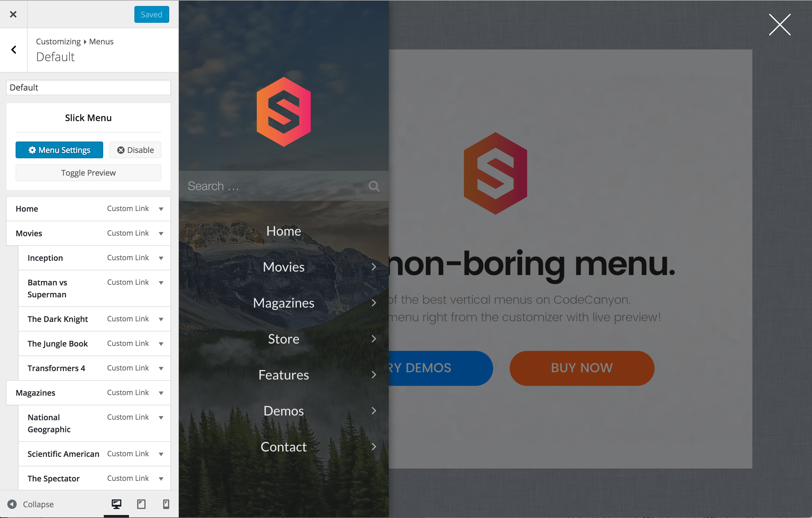
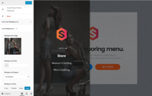
Developers
Javascript API
SlickMenu.toggle
Toggle a menu
Usage
SlickMenu.toggle(menu_id, callback)
Arguments
| Param | Type | Details |
|---|---|---|
| menu_id | integer | WordPress Slick Menu ID |
| callback | function() | On complete callback function |
SlickMenu.open
Open a menu
Usage
SlickMenu.open(menu_id, callback)
Arguments
| Param | Type | Details |
|---|---|---|
| menu_id | integer | WordPress Slick Menu ID |
| callback | function() | On complete callback function |
SlickMenu.openSubLevel
Open a menu sub level
Usage
SlickMenu.openSubLevel(menu_id, menu_item_id, callback)
Arguments
| Param | Type | Details |
|---|---|---|
| menu_id | integer | WordPress Slick Menu ID |
| menu_item_id | integer | WordPress Slick Menu Item ID |
| callback | function() | On complete callback function |
SlickMenu.close
Close a menu
Usage
SlickMenu.close(menu_id, callback)
Arguments
| Param | Type | Details |
|---|---|---|
| menu_id | integer | WordPress Slick Menu ID |
| callback | function() | On complete callback function |
SlickMenu.isOpen
Check if a menu is already open
Usage
SlickMenu.isOpen(menu_id)
Arguments
| Param | Type | Details |
|---|---|---|
| menu_id | integer | WordPress Slick Menu ID |
Returns
| boolean | Returns true if the menu is open or false if it is closed |
SlickMenu.get
Get menu DOM element
Usage
SlickMenu.get(menu_id)
Arguments
| Param | Type | Details |
|---|---|---|
| menu_id | integer | WordPress Slick Menu ID |
Returns
| object | Returns Menu DOM Element or NULL if menu not found |
SlickMenu.getOpen
Get currently opened menu ID
Usage
SlickMenu.getOpen()
Arguments
| Param | Type | Details |
|---|---|---|
| No Arguments | ||
Returns
| integer | Returns WordPress Slick Menu ID or NULL if no menu is currently open |
SlickMenu.getCurrentLevel
Get menu active level if the menu is open
Usage
SlickMenu.getCurrentLevel(menu_id)
Arguments
| Param | Type | Details |
|---|---|---|
| menu_id | integer | WordPress Slick Menu ID |
Returns
| object | Return menu level DOM Element |
SlickMenu.getCurrentLevelDepth
Get menu active level depth if the menu is open
Usage
SlickMenu.getCurrentLevelDepth(menu_id)
Arguments
| Param | Type | Details |
|---|---|---|
| menu_id | integer | WordPress Slick Menu ID |
Returns
| integer | Return menu level depth |
SlickMenu.isCreated
If the menu is set to be loaded on demand via AJAX, this will check if the menu has already been created
Usage
SlickMenu.isCreated(menu_id)
Arguments
| Param | Type | Details |
|---|---|---|
| menu_id | integer | WordPress Slick Menu ID |
Returns
| boolean | Returns true if the menu has been created or false if not |
SlickMenu.reload
Reload a menu via ajax
Usage
SlickMenu.reload(menu_id, callback)
Arguments
| Param | Type | Details |
|---|---|---|
| menu_id | integer | WordPress Slick Menu ID |
| callback | function() | On complete callback function |
SlickMenu.getAlwaysVisible
Get always visible menu ID
Usage
SlickMenu.getAlwaysVisible()
Arguments
| Param | Type | Details |
|---|---|---|
| No Arguments | ||
Returns
| integer | Returns WordPress Slick Menu ID or NULL if no menu is set to be always visible |
SlickMenu.alwaysVisibleEnabled
Check if one of the menus is set to be always visible
Usage
SlickMenu.alwaysVisibleEnabled()
Arguments
| Param | Type | Details |
|---|---|---|
| No Arguments | ||
Returns
| boolean | Returns true if one of the menus is set to be always visible or false if not |
SlickMenu.isAlwaysVisible
Check if a menu is already is always visible
Usage
SlickMenu.isAlwaysVisible(menu_id)
Arguments
| Param | Type | Details |
|---|---|---|
| menu_id | integer | WordPress Slick Menu ID |
Returns
| boolean | Returns true if the menu is set to be always visible or false if not |
SlickMenu.getOption
Get menu option value by key
Usage
SlickMenu.getOption(menu_id, key)
Arguments
| Param | Type | Details |
|---|---|---|
| menu_id | integer | WordPress Slick Menu ID |
| key | string | WordPress Menu Term Meta Key |
Returns
| mix | Returns menu option value |
Javascript Events
sm-loaded
Triggers once a menu is loaded
Usage
$(document.body).on('sm-loaded', function(evt) {

    console.log(evt.detail.menu_id);
    console.log(evt.detail.menu);
});
Event Data
| Param | Type | Details |
|---|---|---|
| menu_id | integer | WordPress Slick Menu ID |
| menu | dom | Menu DOM Element |
sm-reloading
Triggers once a menu starts re-loading via ajax
Usage
$(document.body).on('sm-reloading', function(evt) {

    console.log(evt.detail.menu_id);
    console.log(evt.detail.menu);
});
Event Data
| Param | Type | Details |
|---|---|---|
| menu_id | integer | WordPress Slick Menu ID |
| menu | dom | Menu DOM Element |
sm-reloaded
Triggers once a menu is re-loaded via ajax
Usage
$(document.body).on('sm-reloaded', function(evt) {

    console.log(evt.detail.menu_id);
    console.log(evt.detail.menu);
});
Event Data
| Param | Type | Details |
|---|---|---|
| menu_id | integer | WordPress Slick Menu ID |
| menu | dom | Menu DOM Element |
sm-resize
Triggers on window resize
Usage
$(document.body).on('sm-resize', function(evt) {

    console.log(evt.detail.menu_id);
    console.log(evt.detail.menu);
});
Event Data
| Param | Type | Details |
|---|---|---|
| menu_id | integer | WordPress Slick Menu ID |
| menu | dom | Menu DOM Element |
sm-resize-start
Triggers once window resizing starts
Usage
$(document.body).on('sm-resize-start', function(evt) {

    console.log(evt.detail.menu_id);
    console.log(evt.detail.menu);
});
Event Data
| Param | Type | Details |
|---|---|---|
| menu_id | integer | WordPress Slick Menu ID |
| menu | dom | Menu DOM Element |
sm-resize-stop
Triggers once window resizing stops
Usage
$(document.body).on('sm-resize-stop', function(evt) {

    console.log(evt.detail.menu_id);
    console.log(evt.detail.menu);
});
Event Data
| Param | Type | Details |
|---|---|---|
| menu_id | integer | WordPress Slick Menu ID |
| menu | dom | Menu DOM Element |
sm-opening
Triggers before opening a menu
Usage
$(document.body).on('sm-opening', function(evt) {

    console.log(evt.detail.menu_id);
    console.log(evt.detail.menu);
});
Event Data
| Param | Type | Details |
|---|---|---|
| menu_id | integer | WordPress Slick Menu ID |
| menu | dom | Menu DOM Element |
sm-open
Triggers once a menu starts opening
Usage
$(document.body).on('sm-open', function(evt) {

    console.log(evt.detail.menu_id);
    console.log(evt.detail.menu);
});
Event Data
| Param | Type | Details |
|---|---|---|
| menu_id | integer | WordPress Slick Menu ID |
| menu | dom | Menu DOM Element |
sm-av-open
Triggers once an "Always Visible" menu opens
Usage
$(document.body).on('sm-av-open', function(evt) {

    console.log(evt.detail.menu_id);
    console.log(evt.detail.menu);
});
Event Data
| Param | Type | Details |
|---|---|---|
| menu_id | integer | WordPress Slick Menu ID |
| menu | dom | Menu DOM Element |
sm-open-first
Triggers once a menu starts opening for the first time only
Usage
$(document.body).on('sm-open-first', function(evt) {

    console.log(evt.detail.menu_id);
    console.log(evt.detail.menu);
});
Event Data
| Param | Type | Details |
|---|---|---|
| menu_id | integer | WordPress Slick Menu ID |
| menu | dom | Menu DOM Element |
sm-closing
Triggers before closing a menu
Usage
$(document.body).on('sm-closing', function(evt) {

    console.log(evt.detail.menu_id);
    console.log(evt.detail.menu);
});
Event Data
| Param | Type | Details |
|---|---|---|
| menu_id | integer | WordPress Slick Menu ID |
| menu | dom | Menu DOM Element |
sm-close
Triggers once a menu closes
Usage
$(document.body).on('sm-close', function(evt) {

    console.log(evt.detail.menu_id);
    console.log(evt.detail.menu);
});
Event Data
| Param | Type | Details |
|---|---|---|
| menu_id | integer | WordPress Slick Menu ID |
| menu | dom | Menu DOM Element |
sm-av-close
Triggers once an "Always Visible" menu closes
Usage
$(document.body).on('sm-av-close', function(evt) {

    console.log(evt.detail.menu_id);
    console.log(evt.detail.menu);
});
Event Data
| Param | Type | Details |
|---|---|---|
| menu_id | integer | WordPress Slick Menu ID |
| menu | dom | Menu DOM Element |
sm-level-opening
Triggers before opening a menu level
Usage
$(document.body).on('sm-level-opening', function(evt) {

    console.log(evt.detail.menu_id);
    console.log(evt.detail.menu);
    console.log(evt.detail.level);
    console.log(evt.detail.levelDepth);
});
Event Data
| Param | Type | Details |
|---|---|---|
| menu_id | integer | WordPress Slick Menu ID |
| menu | dom | Menu DOM Element |
| level | dom | Menu Level DOM Element |
| levelDepth | integer | Menu Level Depth |
sm-level-open
Triggers once a menu level starts opening
Usage
$(document.body).on('sm-level-open', function(evt) {

    console.log(evt.detail.menu_id);
    console.log(evt.detail.menu);
    console.log(evt.detail.level);
    console.log(evt.detail.levelDepth);
});
Event Data
| Param | Type | Details |
|---|---|---|
| menu_id | integer | WordPress Slick Menu ID |
| menu | dom | Menu DOM Element |
| level | dom | Menu Level DOM Element |
| levelDepth | integer | Menu Level Depth |
sm-level-opened
Triggers once a menu level has opened
Usage
$(document.body).on('sm-level-opened', function(evt) {

    console.log(evt.detail.menu_id);
    console.log(evt.detail.menu);
    console.log(evt.detail.level);
    console.log(evt.detail.levelDepth);
});
Event Data
| Param | Type | Details |
|---|---|---|
| menu_id | integer | WordPress Slick Menu ID |
| menu | dom | Menu DOM Element |
| level | dom | Menu Level DOM Element |
| levelDepth | integer | Menu Level Depth |
sm-level-inactive
Triggers once a menu level becomes inactive. (opened, however appears behind another level)
Usage
$(document.body).on('sm-level-inactive', function(evt) {

    console.log(evt.detail.menu_id);
    console.log(evt.detail.menu);
    console.log(evt.detail.level);
    console.log(evt.detail.levelDepth);
});
Event Data
| Param | Type | Details |
|---|---|---|
| menu_id | integer | WordPress Slick Menu ID |
| menu | dom | Menu DOM Element |
| level | dom | Menu Level DOM Element |
| levelDepth | integer | Menu Level Depth |
sm-level-active
Triggers once a menu level becomes active. (opened, and appears on top off all other levels)
Usage
$(document.body).on('sm-level-active', function(evt) {

    console.log(evt.detail.menu_id);
    console.log(evt.detail.menu);
    console.log(evt.detail.level);
    console.log(evt.detail.levelDepth);
});
Event Data
| Param | Type | Details |
|---|---|---|
| menu_id | integer | WordPress Slick Menu ID |
| menu | dom | Menu DOM Element |
| level | dom | Menu Level DOM Element |
| levelDepth | integer | Menu Level Depth |
sm-level-close
Triggers once a menu level closes
Usage
$(document.body).on('sm-level-close', function(evt) {

    console.log(evt.detail.menu_id);
    console.log(evt.detail.menu);
    console.log(evt.detail.level);
    console.log(evt.detail.levelDepth);
});
Event Data
| Param | Type | Details |
|---|---|---|
| menu_id | integer | WordPress Slick Menu ID |
| menu | dom | Menu DOM Element |
| level | dom | Menu Level DOM Element |
| levelDepth | integer | Menu Level Depth |